
Purkarthofer Eis: Brand Identity

Apr 2025
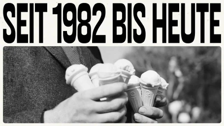
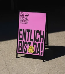
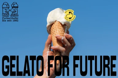
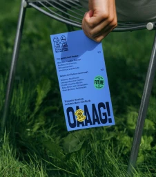
Purkarthofer Eis modernizes its market presence through a comprehensive brand identity project designed by RAWTY. The visual system leverages a clean aesthetic, characterized by bold, sans-serif typography and a vibrant palette of yellow, pink, and purple. By integrating hand-drawn illustrations with structured graphic design, the identity balances a nostalgic, heritage-focused narrative—referenced by the brand’s 1982 establishment—with a contemporary, minimalist approach. Execution across the identity spans both physical collateral and digital touchpoints. The project includes motion graphics, website design, and print materials, unified by playful iconography and dynamic transitions. The work utilizes natural light in its photographic compositions to emphasize the organic nature of its ingredients, while the motion design pieces incorporate vector-based animation to showcase loyalty programs and product showcases. The result is a cohesive, approachable brand image that positions the ice cream label within a modern food and beverage context.
Horizontal, Clean, Commercial
Typography
Advertising Campaign
