
Pure Represents: Brand Identity


Jun 2022
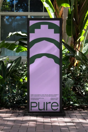
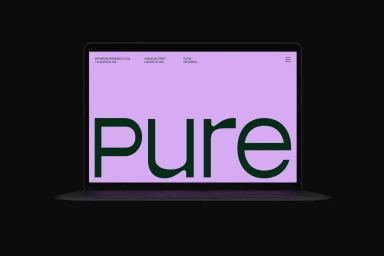
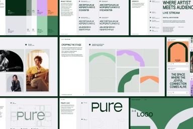
Studio Kiln developed the brand identity for Pure Represents, delivering a comprehensive visual system that balances structured graphic design with a flexible, tactile aesthetic. The work spans environmental signage, artist collateral, and digital assets, utilizing a distinct color palette of green, lavender, and orange to anchor the brand identity across diverse touchpoints. The project incorporates a clean design language, employing arched framing and sans-serif typography to create a cohesive look. From urban street-level paste-ups and outdoor signage to digital screens and printed artist passes, Studio Kiln’s execution utilizes vector-based graphics and minimalist layouts. The brand guidelines provide a framework for these modular elements, showcasing how consistent logo construction and typography hierarchies maintain visual impact across both print and digital mediums.
Horizontal, Clean, Commercial
