
Pauli & Sisters: Brand Identity



May 2021
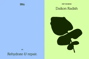
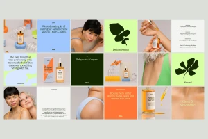
The brand identity for skincare label Pauli & Sisters establishes a visual system centered on natural ingredients and tactile materiality. Designed by Marina Veziko, the project integrates product packaging with a cohesive suite of graphic design assets, spanning from serum bottle labeling to typographic quote cards. The aesthetic leans into a minimalist approach, employing a palette of muted pastels accented by vibrant greens and oranges. The execution utilizes clean geometric planes and a balance of serif typography to highlight botanical elements. Through techniques including emboss and deboss detailing and CGI, the identity frames the Repair serum range within a structured, modern commercial layout.
Horizontal, Commercial, Clean, Minimalist
