
Papier: Brand Identity

Oct 2019
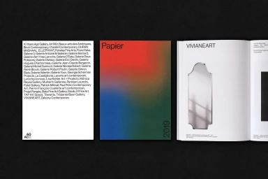
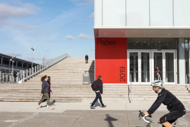
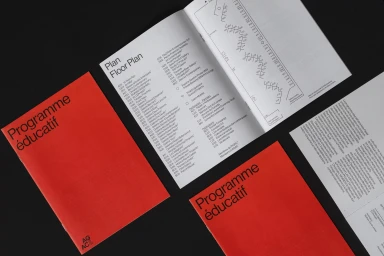
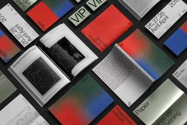
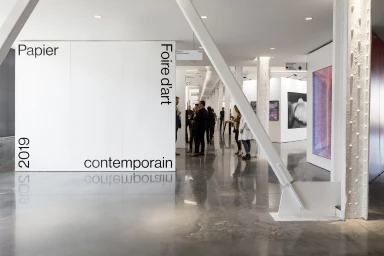
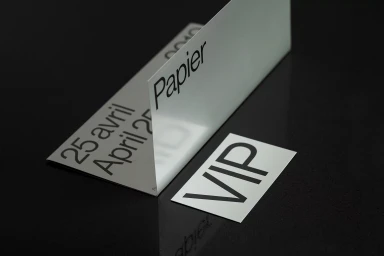
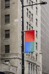
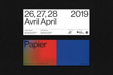
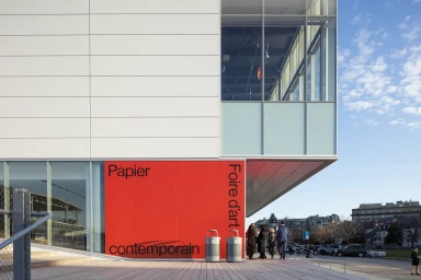
The brand identity for Papier, a prominent contemporary art fair, masterfully channels a sophisticated and highly structured design language that balances corporate precision with an expressive artistic sensibility. Throughout this expansive project, the visual system leans into editorial minimalism, defined by a bold sans-serif typography that anchors every touchpoint, from large-scale architectural signage on building facades to the intimate, high-contrast layouts found in VIP stationery and printed brochures. The graphic execution, led by the project's Principal, utilizes a vibrant color palette of bright red, white, and deep gradients to provide a rhythmic visual contrast against dark, textured backgrounds. This aesthetic coherence translates seamlessly across diverse media, including environmental installations that interact with natural light and precisely grid-based informational graphics. By maintaining a professional yet modern layout, the design effectively communicates complex event information while preserving the clean, airy atmosphere of the exhibition space itself. The work is deeply grounded in professional commercial principles, emphasizing a clean information hierarchy that feels both current and timeless. Ultimately, this comprehensive identity system showcases how meticulous typography and intentional grid-based layouts can elevate event branding into a cohesive, high-end experience that resonates within the contemporary art landscape, proving that functional information design can be as visually compelling as the art it represents.
Horizontal, Commercial, Clean, Minimalist
Typography
Advertising Campaign
