
Palermo FC
Brand Identity
Aug 2026
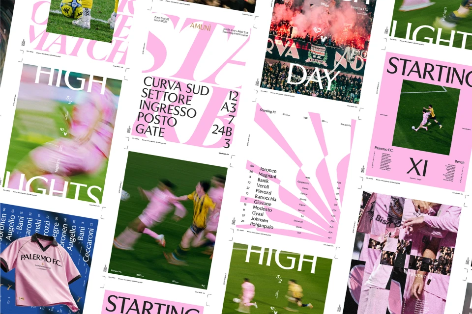
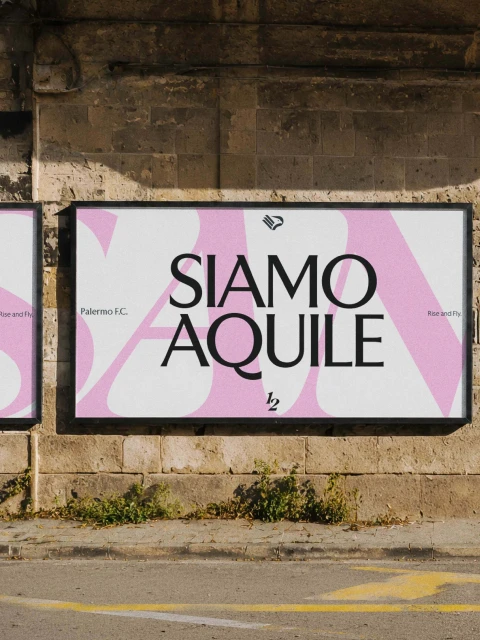
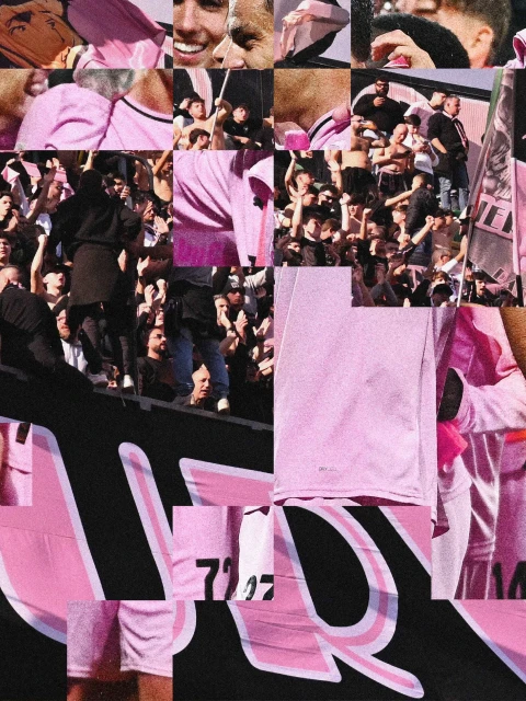
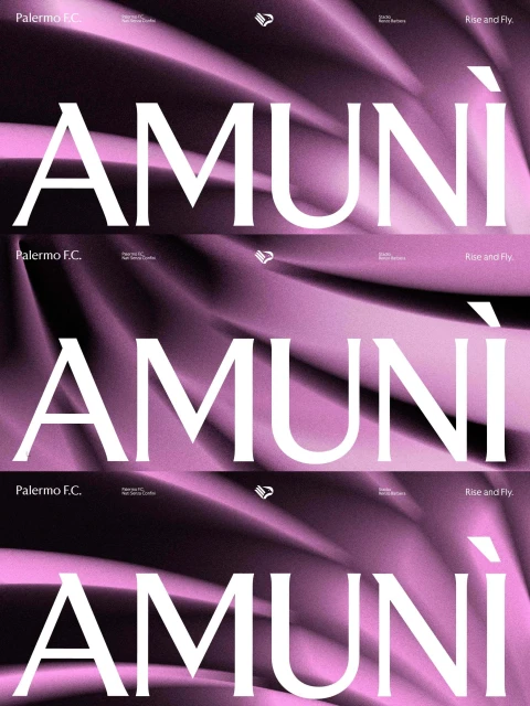
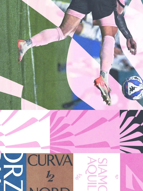
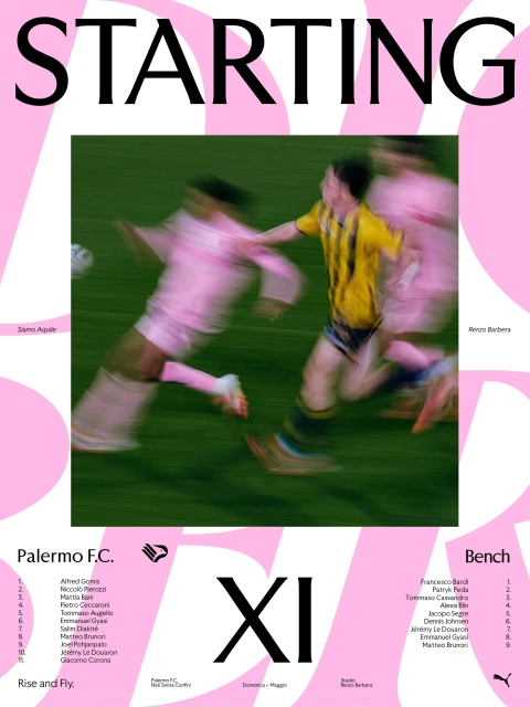
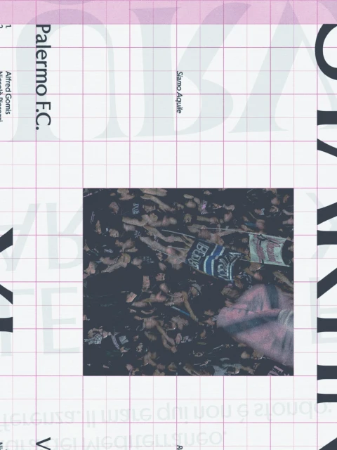
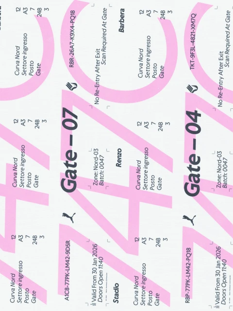
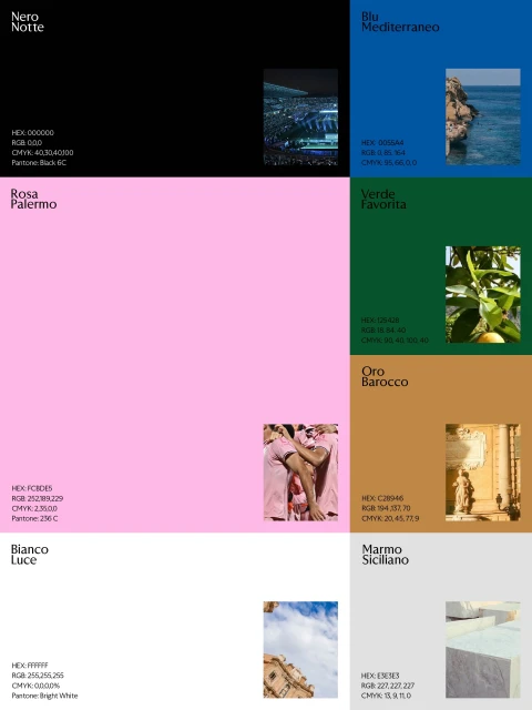
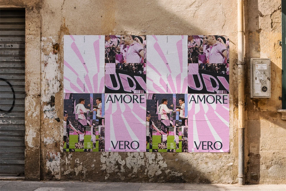
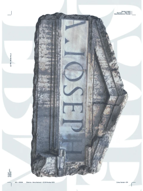
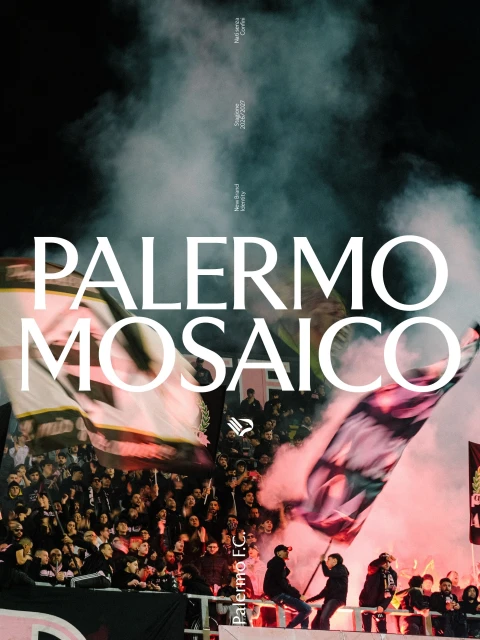
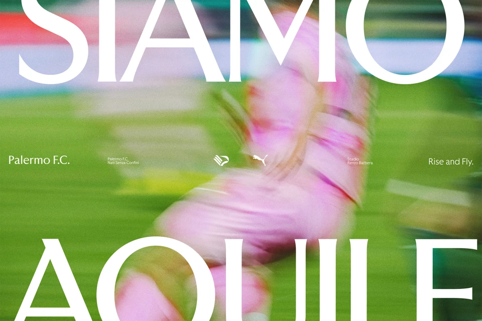
The brand identity overhaul for Palermo FC serves as a masterclass in modern sports branding, successfully bridging the gap between historic club heritage and contemporary graphic design. By leaning into a sophisticated visual language that prioritizes editorial minimalism and clean typography, the project elevates the team’s identity far beyond the pitch. The execution effectively balances high-energy live-action technique with a structured, corporate aesthetic, utilizing a distinct color palette—Rosa Palermo, Nero Notte, and Blu Mediterraneo—to honor the club’s deep-rooted connection to its home. The design strategy, helmed by the creative team at Alkemy, masterfully integrates archival research and raw fan culture with polished, high-contrast serif lettering. From stadium signage and ticketing systems to dynamic social collateral, the work channels a sense of local pride through layered collages and atmospheric cinematic imagery. Whether depicting the kinetic motion blur of players in their iconic pink kits or the rugged texture of weathered Sicilian stone, the identity is cohesive, tactile, and highly intentional. The project demonstrates how professional graphic design can transform raw, emotional sporting passion into a refined, recognizable brand system. By blending symmetrical 3D renders with candid documentary-style photography, the identity feels both timeless and aggressively modern, setting a new gold standard for professional football branding in an increasingly competitive global landscape.
Graphic, Vertical, Commercial
Typography
Soccer
Advertising Campaign
![[Alkemy]+](https://ui-avatars.com/api/?size=125&color=9d9d9d&name=[&E.jpg)