
ONE’s urban practice: Brand Identity
Aug 2026
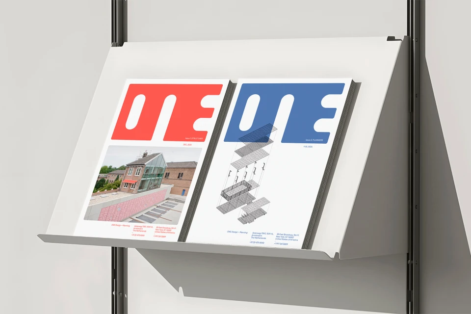
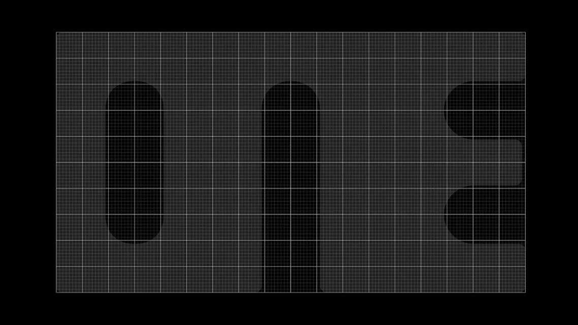
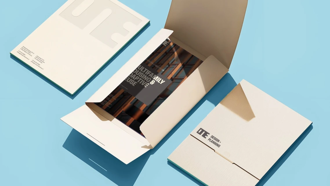
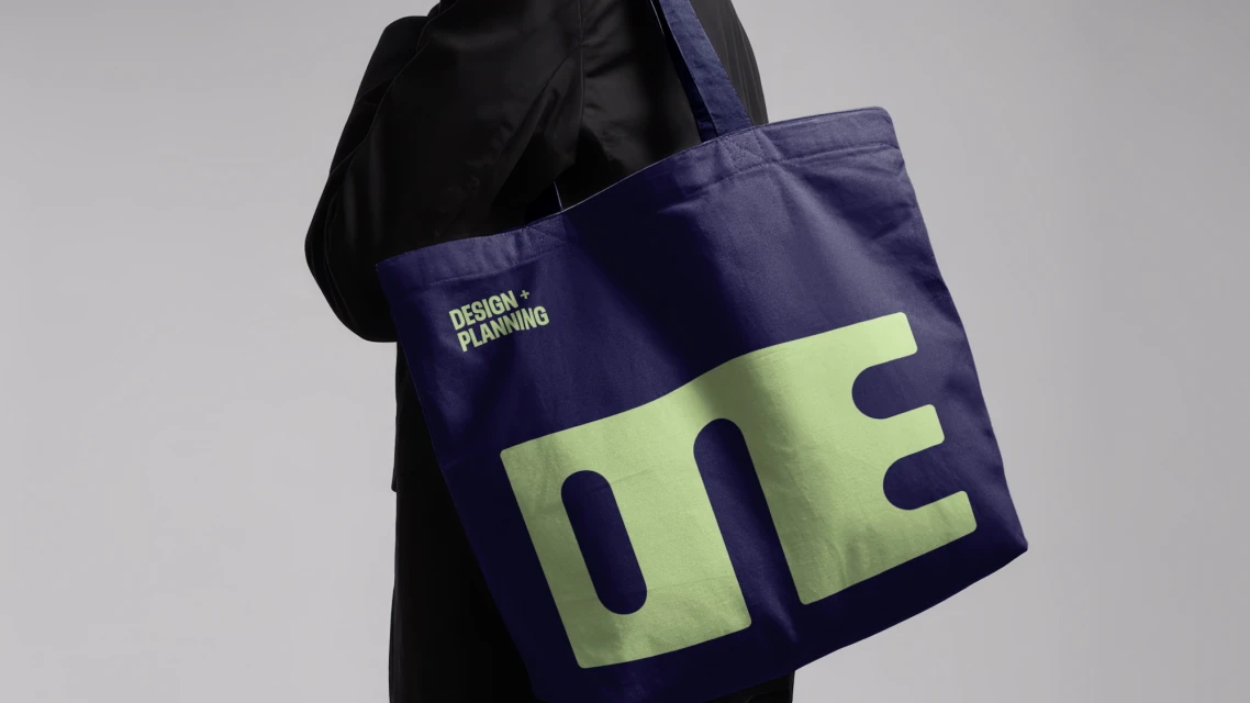
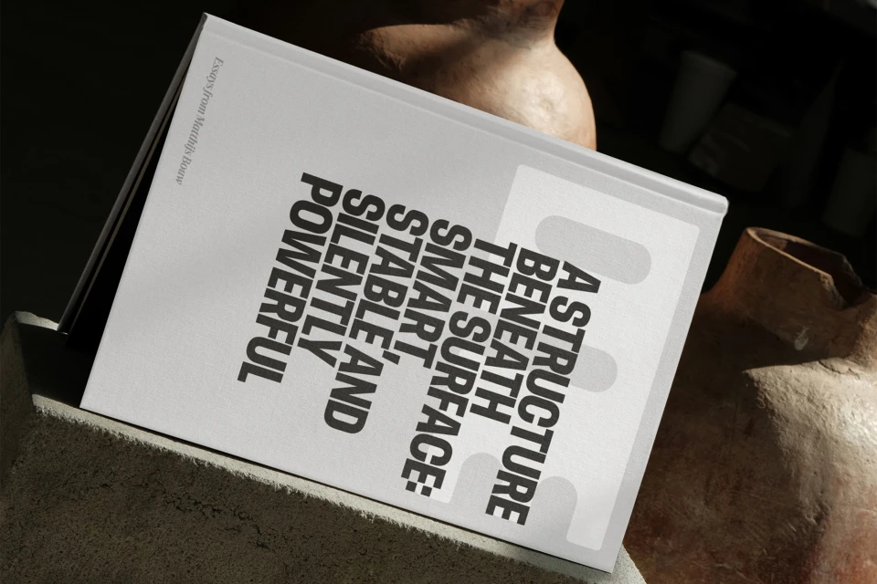
For ONE’s urban practice, the brand identity project masterfully translates complex architectural concepts into a cohesive, minimalist visual language. By balancing the rigors of design and planning with the fluidity of urban environments, the identity captures the firm’s multidisciplinary essence through a sophisticated use of corporate typography and motion graphics. The design system leans into a high-contrast aesthetic, utilizing the Zed Display and Feature Display typefaces to anchor a narrative that is both elegant and precise. Through a diverse array of media—ranging from cinematic drone footage of highway interchanges to tactical UI illustration and intricate 3D render / CGI work—the identity establishes a strong, professional presence. Design agency 5x5 succeeds in creating a structured framework where clean grid lines and bold wordmarks unify disparate elements, while 3D artist Jake Greenwood introduces organic tension through textural contrasts, such as moss-covered masonry against fluid liquid metal. This branding effort avoids excess, favoring a clean and modern tone that emphasizes the technical beauty of its components. From the sharp shadows cast on heavy-stock paper to the tactile nature of branded canvas totes, the project presents a holistic vision for the firm, effectively grounding abstract planning in the concrete reality of its structures. The result is a refined, highly functional aesthetic that speaks to both industry professionals and the public alike.
Horizontal, Commercial, Clean, Minimalist
3D render / CGI

