
nötter: Brand Identity



Apr 2020
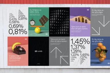
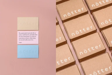
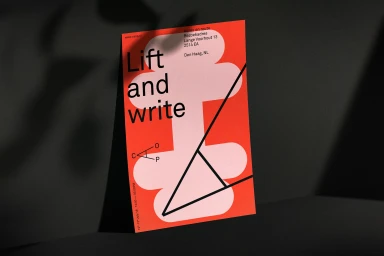
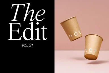
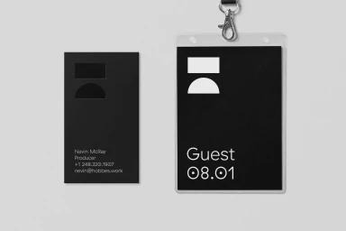
The brand identity for nötter represents a masterclass in modern commercial design, where minimalist principles meet a vibrant, tactile sensibility. Developed through a cross-disciplinary creative effort involving expertise from Stephen Kelleher Studio, Essen International, and Mohamed Samir, the identity leans into a structured yet playful aesthetic that balances corporate utility with artistic flair. The project utilizes a sophisticated palette—frequently anchored by a signature soft pink—to unify a range of materials, from matte brown cardboard packaging and embossed stationery to wheatpaste-style posters that incorporate bold Swedish typography. Techniques such as 3D render CGI and high-contrast emboss and deboss applications bring a tangible quality to the brand’s touchpoints, ensuring each element feels both professional and human-centric. The visual language effectively uses motion graphics and abstract geometric forms to articulate a clear informational hierarchy, as seen in the balance of sans-serif type and metaphorical imagery. Whether through suspended paper cups or carefully layered card stock, the work emphasizes a clean, contemporary design language that is both consistent and versatile. By weaving together high-contrast graphic elements with soft, natural lighting, the nötter identity avoids corporate sterility, opting instead for a deliberate, artistic minimalism that feels at once modern, structural, and deeply engaging across its various commercial and print applications.
Horizontal, Commercial, Minimalist, Clean


