
Brand
ProjectBrand Identity
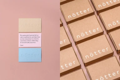
nötter Brand Identity 2020
Associated creatives


Tags
Description
This brand identity showcase presents a clean and modern design system for Notter. The composition is split into two sections against a soft pink background. On the left side, three rectangular paper cards in beige, pale pink, and light blue are stacked vertically, featuring debossed typography and descriptive product text. On the right side, a neat grid of brown cardboard product boxes is arranged with crisp white printed branding. The lighting is bright and even, highlighting the tactile paper textures and minimalist aesthetic.