
Brand
ProjectBrand Identity
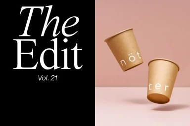
nötter Brand Identity 2020
Associated creatives


Tags
Description
This commercial design piece presents a striking split composition for the notter brand identity project. The left side features bold white serif typography reading The Edit Vol. 21 against a solid black field. The right side displays two kraft paper coffee cups levitating in mid-air against a soft pink backdrop, each marked with white lettering. The clean minimalist arrangement highlights product packaging and visual identity design through sharp contrast and balanced framing.