
Neat: Brand Identity
Apr 2020
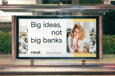
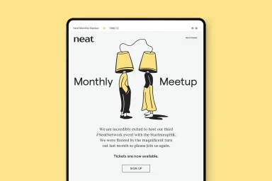
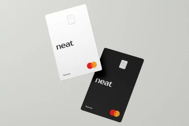
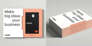
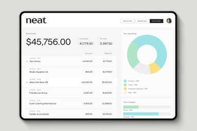
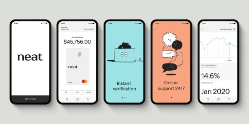
In the increasingly crowded landscape of fintech, Neat stands out by rejecting the cold, institutional tropes that have long defined the finance industry. This comprehensive brand identity, brought to life through the expert graphic design of Ragged Edge, channels a refreshing, human-centric approach that speaks directly to the modern entrepreneur. By utilizing a clean, minimalist design language, the project masterfully balances the functional requirements of a digital banking platform with a bold, approachable personality. The visual system, characterized by sophisticated typography and a thoughtful use of UI illustration, creates a cohesive narrative that stretches from high-impact out-of-home advertising to the nuanced, user-centric screens of their mobile application. Whether displayed as an oversized billboard statement or a precise digital dashboard, the aesthetic remains grounded in professional simplicity. Soft lighting and high-contrast color palettes in the product collateral underscore a commitment to quality and transparency, while artistic vector elements in email invitations inject a touch of creative spirit into typically mundane financial communications. The resulting brand identity feels less like a legacy institution and more like a forward-thinking partner, successfully leveraging corporate imagery and natural light to transform complex fiscal tools into accessible, everyday solutions for a generation of business owners who prioritize big ideas over the rigidity of traditional banking models.
Horizontal, Commercial, Clean, Minimalist
