
Near: Brand Identity
Brand
Date
Jan 2024
Description
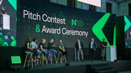
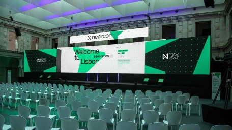
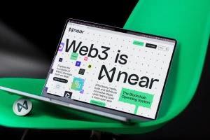
Near, a digital platform within the technology sector, developed a comprehensive brand identity system led by the design studio Fold7Design. The project encompasses a wide-reaching design language that spans digital interfaces, physical event signage for the Nearcon 23 conference, and high-contrast motion graphics. By prioritizing a minimalist aesthetic, the identity utilizes clean, vector-based typography and a modular grid system to communicate complex information. Across both mobile UI displays and outdoor billboard animations, the visual system leans into high-contrast color palettes and motion graphics to maintain consistency across various digital touchpoints.
Style
Horizontal, Clean, Commercial
Industries
Color
Lime
Pure White
Context
Brand Film / Corporate Video
Associated creatives

5000+ creatives to discover
Sign up to gain access to the entire directory. It’s free.
Visie is a curated library of creative professionals.