
Mano: Brand Identity


May 2021
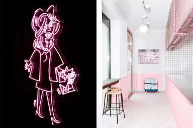
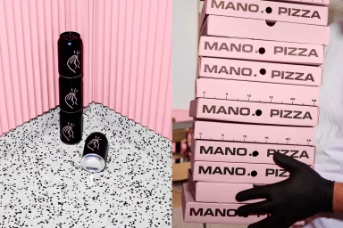
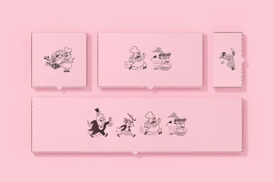
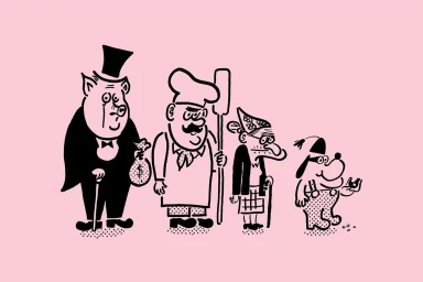
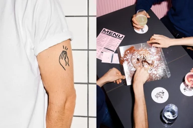
Mano's brand identity, developed by Goods, Samuel Nyholm, OMHU, and Jan Khür, establishes a distinct visual language for the food and beverage brand. The project centers on a playful, graphic-heavy aesthetic, featuring line-art illustrations by Samuel Nyholm that span across packaging, signage, and collateral. The identity leans into a high-contrast pastel palette, balancing soft pink tones with minimalist black linework. Photography by Jan Khür captures the application of these elements within a commercial setting, highlighting the interior design by OMHU, which utilizes clean tiled surfaces and terrazzo finishes. Techniques such as neon light installations and vector-based illustrations are integrated throughout, creating a unified look that flows from custom pizza boxes and matchbooks to the editorial framing of the dining environment.
Horizontal, Commercial, Clean, Minimalist
Advertising Campaign


