
Meatable: Brand Identity



Nov 2020
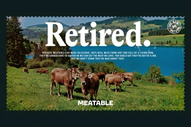
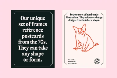
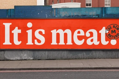
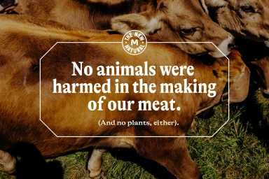
Meatable’s brand identity project, designed by Koto, balances modern graphic design with pastoral, natural imagery to communicate its focus on sustainable food production. The visual language uses bold serif typography and clean layouts, often presented against outdoor landscapes, to frame messages about science and ethical food alternatives. The project encompasses a comprehensive suite of assets, ranging from static print collateral and urban billboard advertising to digital interfaces and motion graphics. Across these formats, the design employs a retro-inspired aesthetic featuring scalloped edges and badge emblems alongside clean, minimalist digital layouts, creating a consistent identity across both physical and mobile environments.
Horizontal, Commercial, Clean
Typography
