
KIOSK: Brand Identity


Brand
Date
Mar 2021
Description
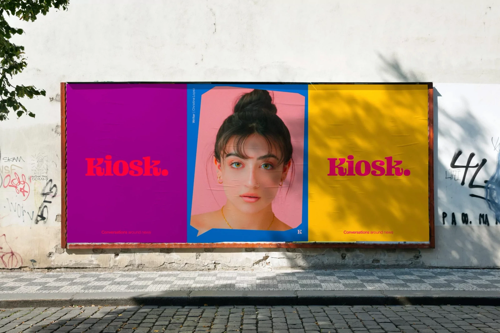
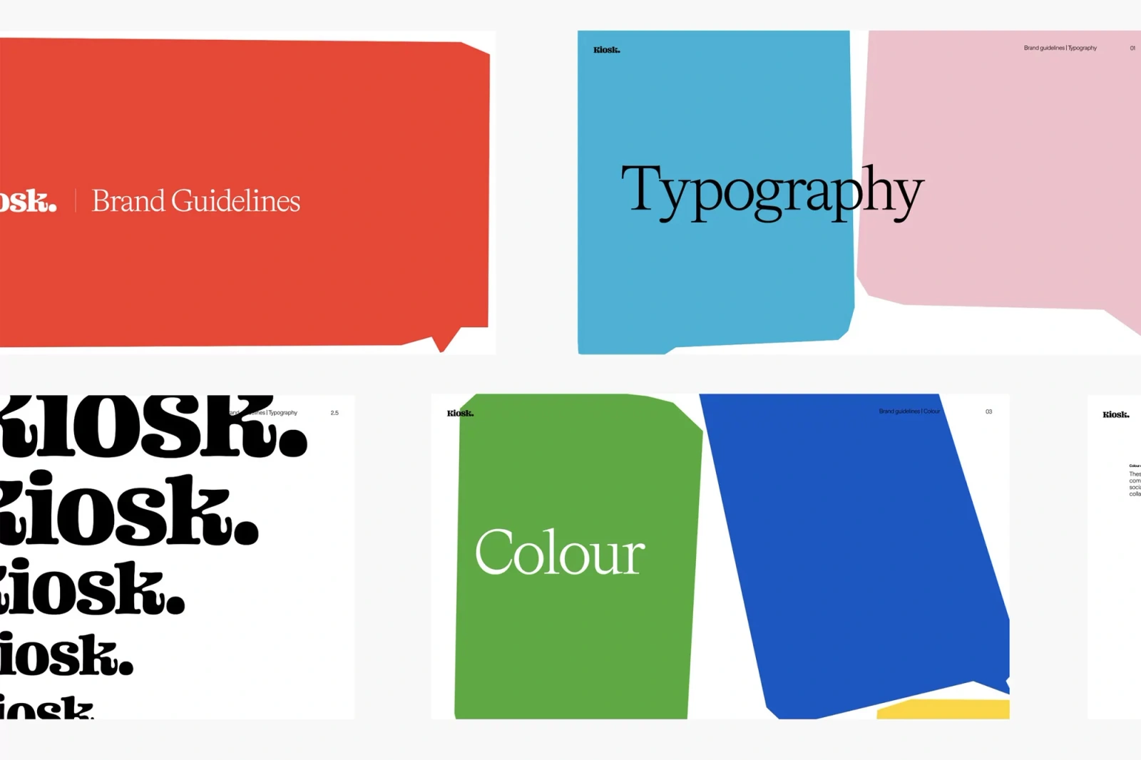
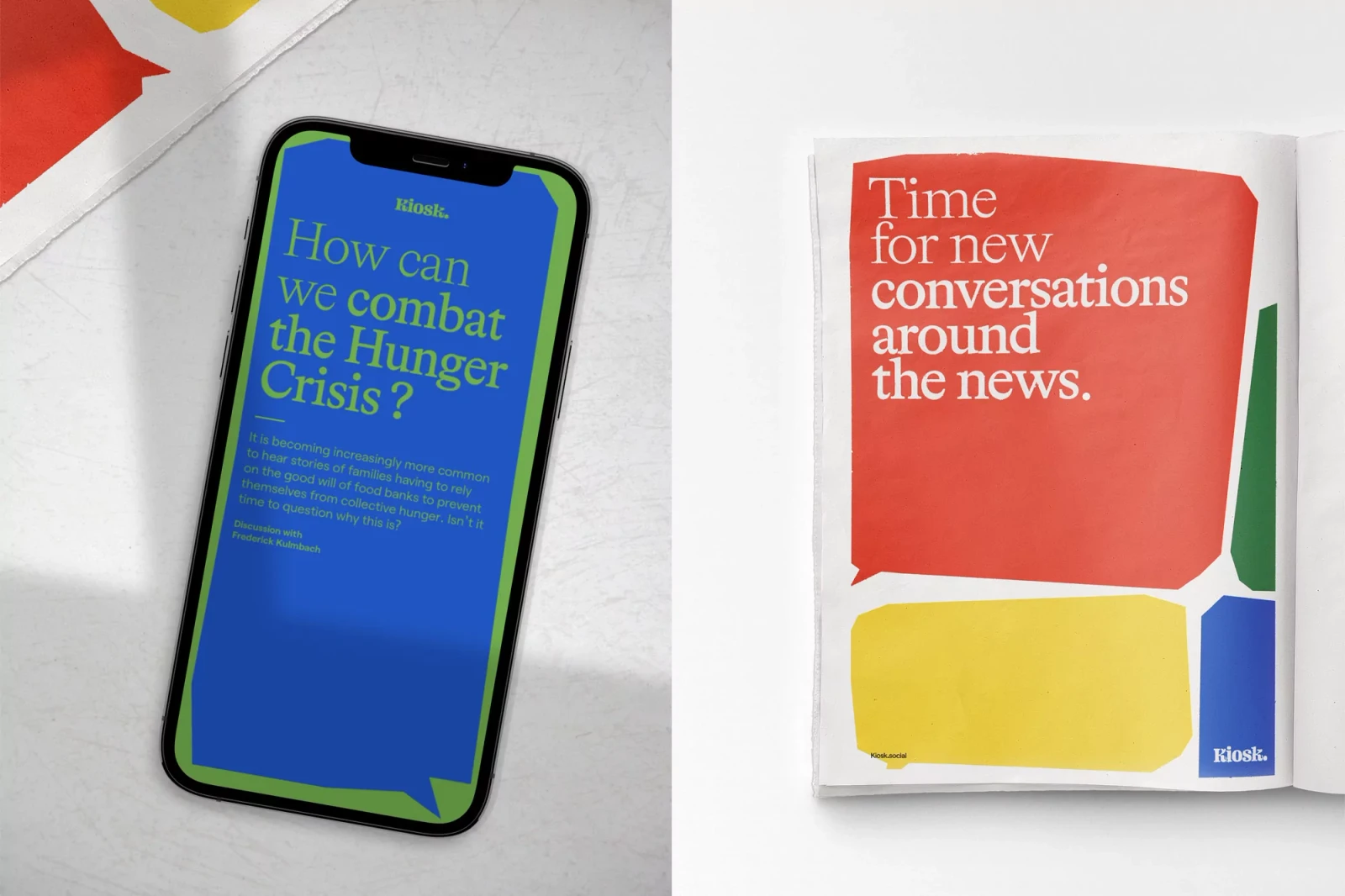
The KIOSK brand identity, developed by Justified Studio, establishes a cohesive visual language across print and digital media. The design system utilizes a palette of vibrant primary colors and bold serif typography, structured through geometric grid alignments and layered graphic compositions. Executing across billboard, editorial print, and UI illustration, the identity leans into clean, minimalist aesthetics. The motion graphics components and vector-based assets reinforce the system's flexibility, balancing functional information with a modern, editorial approach to digital publishing.
Style
Horizontal, Commercial, Clean, Graphic
Techniques
Typography
Associated creatives

5000+ creatives to discover
Sign up to gain access to the entire directory. It’s free.
Visie is a curated library of creative professionals.