
Brightfield
Brand Identity
Jun 2026
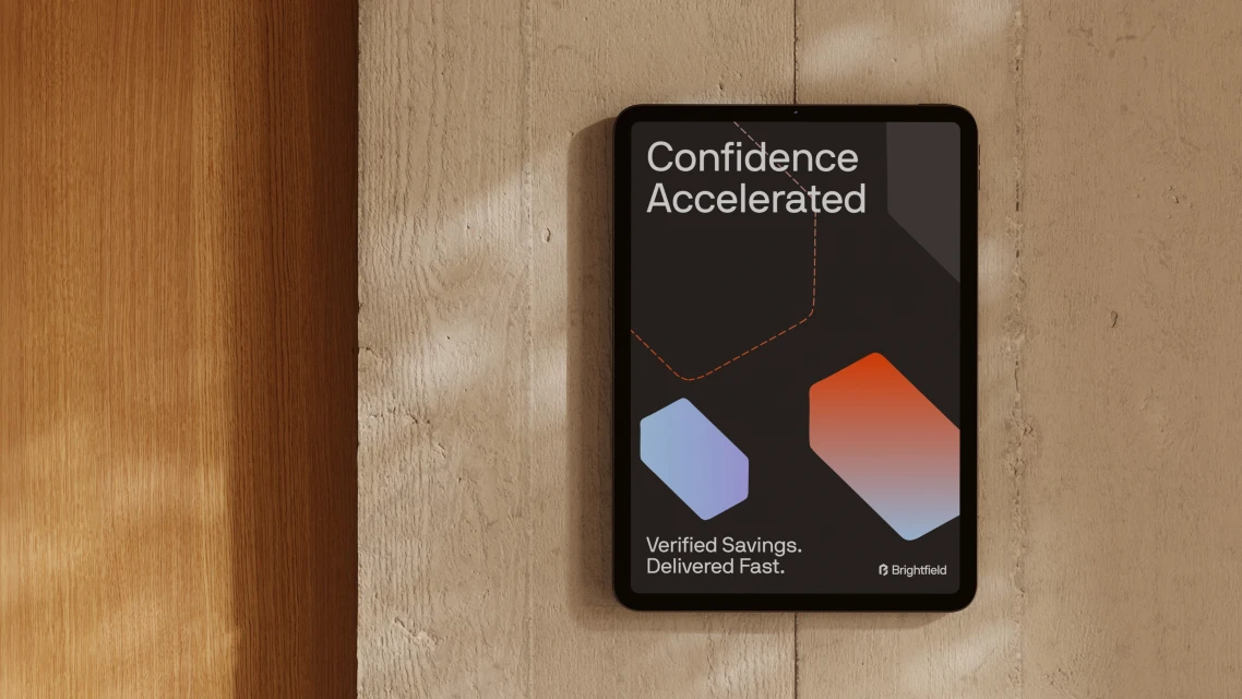
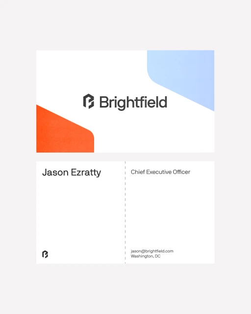
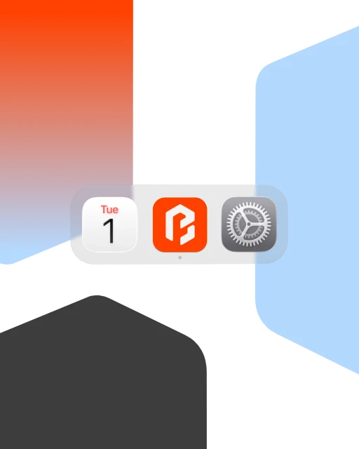
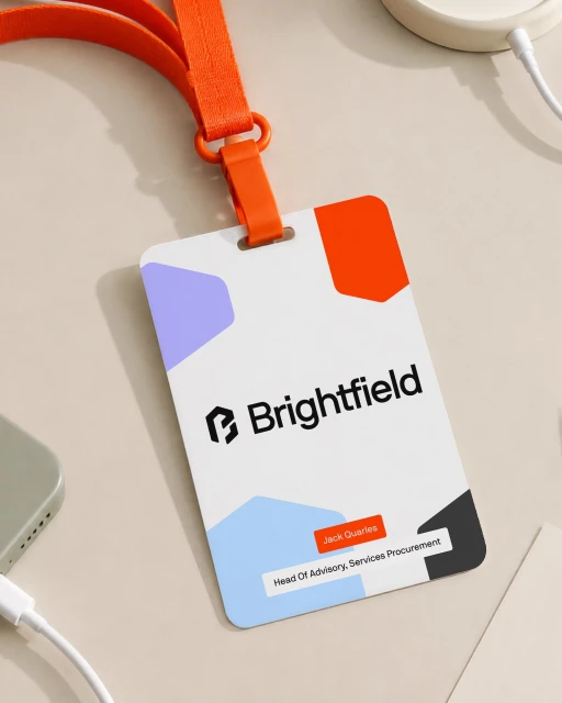
Brightfield has unveiled a comprehensive brand identity that masterfully bridges the gap between high-tech functionality and corporate accessibility. Executed by the team at Justified Studio, the new visual language relies on a refined palette of soft blues and vibrant oranges, set against neutral, architectural backdrops to anchor the brand in professionalism. The identity work, which encompasses everything from sophisticated corporate ID badges to streamlined mobile interface designs, leans into a minimalist aesthetic that favors clarity and geometric precision over unnecessary complexity. By utilizing a blend of high-end CGI 3D renders for ambient environmental shots alongside sharp, vector-based graphic design for collateral like business cards, the project creates a cohesive world where digital solutions feel tangible and human-centric. The use of dappled natural light in the presentation photography provides an organic warmth, softening the edges of the technical interface layouts. This thoughtful approach ensures that the Brightfield brand feels both modern and established, favoring clean lines and an intuitive user experience. Through this holistic creative direction, Justified Studio has successfully transformed the abstract concept of procurement and services into a visually arresting, high-tech experience that communicates confidence and acceleration at every customer touchpoint, whether viewed on a smartphone screen or held as a physical badge.
Clean, Minimalist, Horizontal, Commercial
Apps & Digital Platforms
Brand Film / Corporate Video
