
Joyce Shi: Brand Identity

Aug 2024
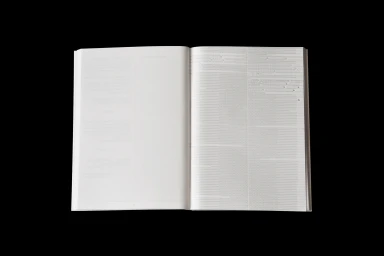
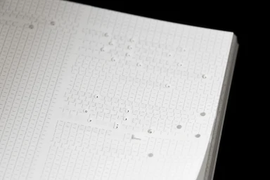
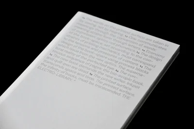
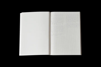
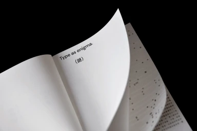
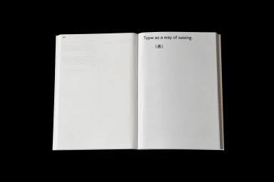
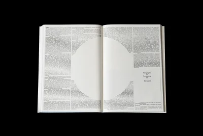
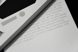
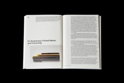
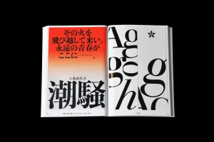
Joyce Shi presents a comprehensive brand identity project centered on precise typographic systems and editorial design. The work explores the tactile nature of print, utilizing high-contrast, minimalist layouts that emphasize generous negative space and structured column grids. Across a series of booklets and publication spreads, the project leans into clean sans-serif and serif arrangements to establish a distinct visual language. Technical execution focuses on physical material qualities, incorporating emboss and deboss techniques on textured paper stocks. The identity concept balances rigid geometric motifs with expressive typographic scaling, moving between sparse, orderly columns and bold, high-contrast graphic treatments.
Horizontal, Clean, Minimalist
Typography
Editorial
