
Jassel
Brand Identity

Oct 2017
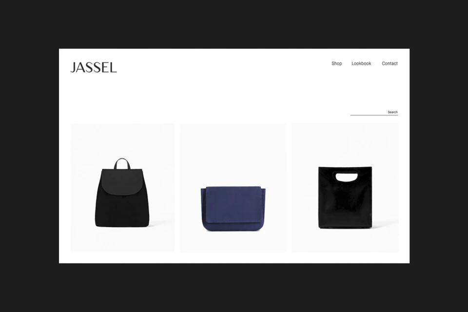
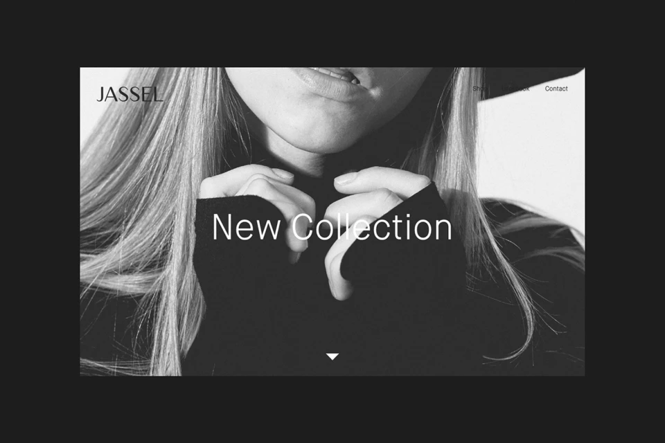
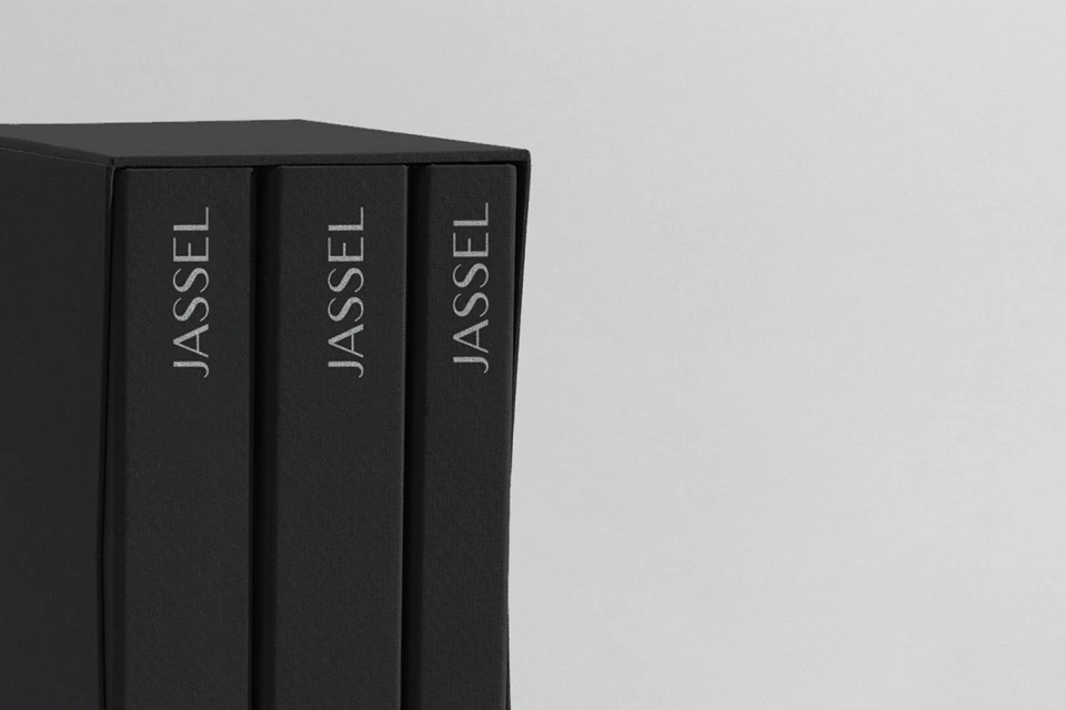
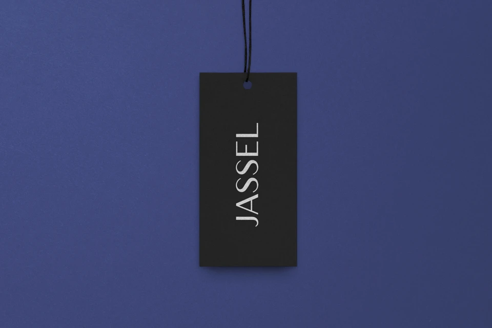
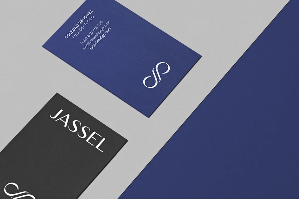
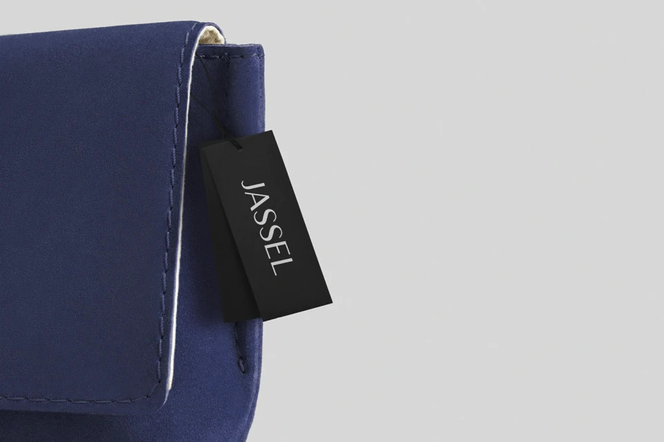
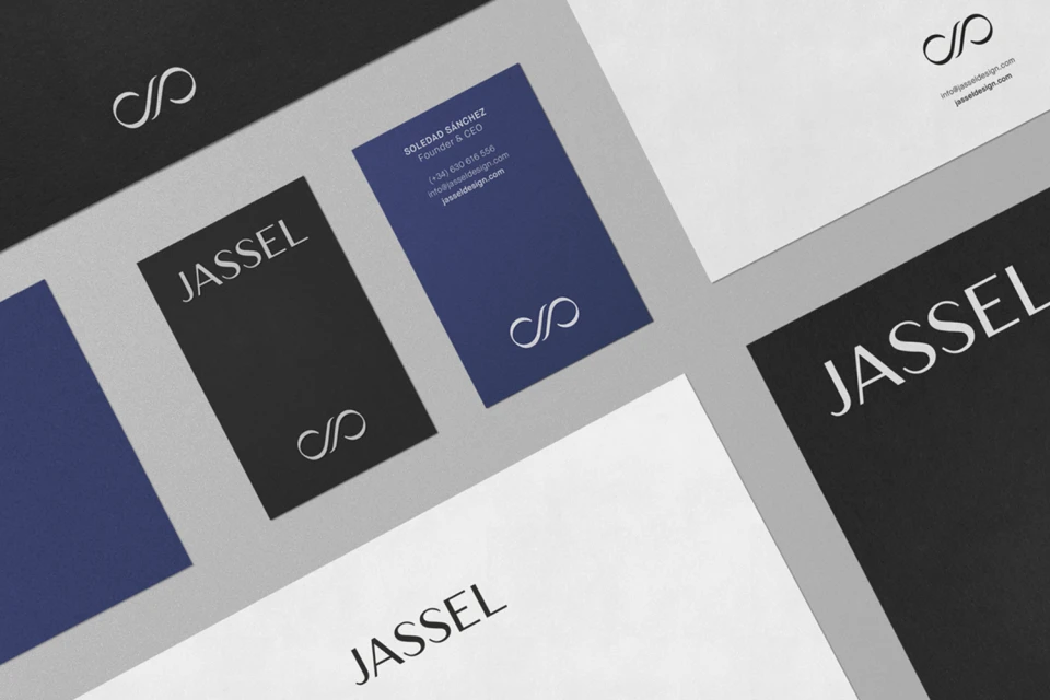
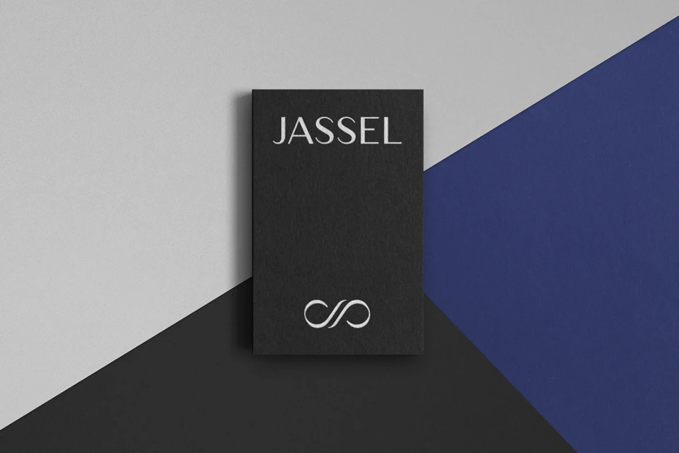
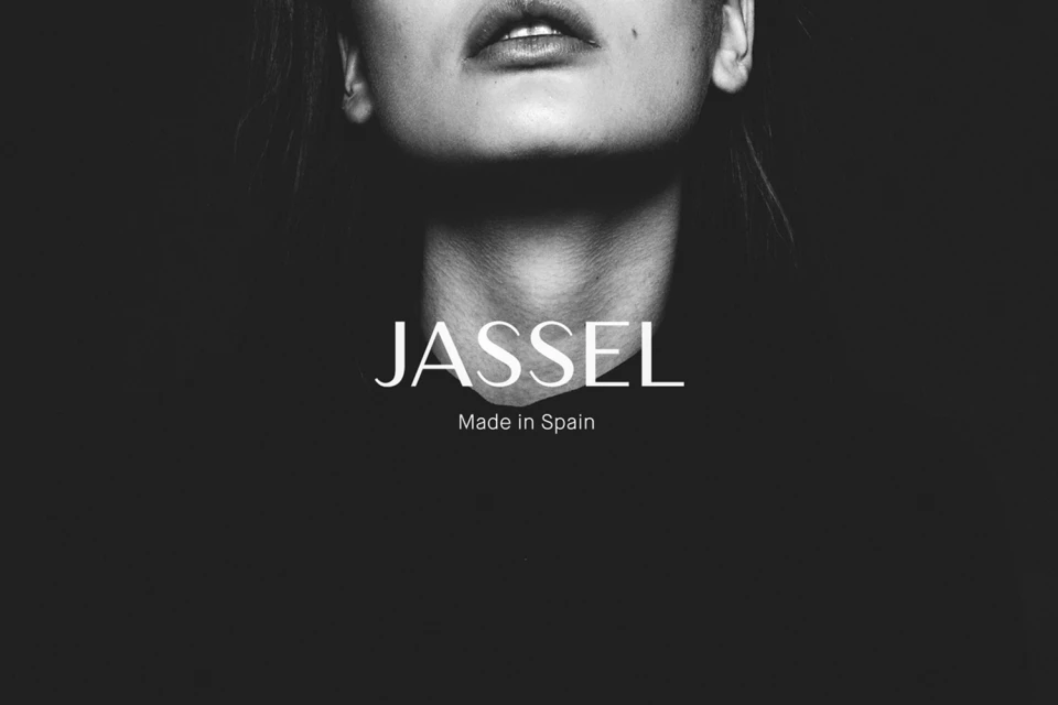
The brand identity for Jassel strikes a masterclass in minimalist luxury, meticulously crafting a visual language that balances clinical precision with an evocative sense of high-end fashion. Led by the design vision of Sonia Castillo Studio, the project builds a cohesive ecosystem that translates seamlessly from digital UI illustration to tangible, tactile physical assets. The aesthetic leans heavily into a restrained palette of charcoal black, deep navy, and crisp white, using sharp, refined serif typography and a signature infinity-style monogram to anchor the brand. Throughout the visual narrative, the design employs strategic techniques such as cinematic low-key lighting and structured studio strobe photography to emphasize the architectural form of both the products and the packaging. Whether through the clean lines of the e-commerce interface, the matte texture of the custom stationery, or the deliberate, high-contrast portraiture, the project maintains a consistent corporate tone that feels both timeless and aggressively modern. By integrating elements like 3D render/CGI visuals with delicate print applications—such as the translucent lavender-branded tissue paper—the identity manages to feel high-touch and bespoke. It is a textbook example of cohesive branding where every detail, from the placement of a hang tag to the kerning of the logo, serves to reinforce Jassel as a sophisticated player in the premium market space, proving that true elegance resides in the nuance of execution.
Horizontal, Commercial, Clean, Minimalist
E-commerce / Product
