Harry's: Brand Identity
May 2025
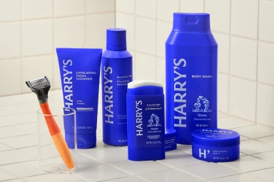
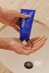
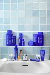
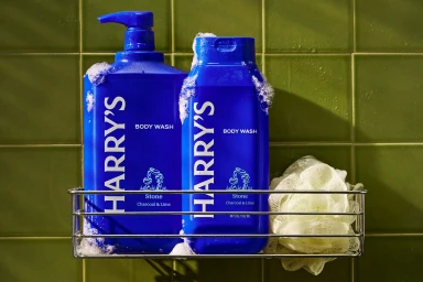
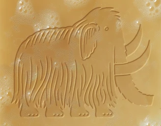
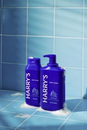
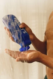
This brand identity project for Harry's establishes a distinct visual language within the beauty and personal care sector. The execution centers on a signature royal blue palette paired with clean, high-contrast white typography, applied across a range of grooming products including body wash, styling creams, and shaving essentials. Graphic design agencies Mythology and COLLINS led the visual direction, emphasizing a balance of functional minimalism and identifiable iconography. Captured through commercial photography, the work features tactile elements and natural light to emphasize product textures. From embossed soap bars to integrated bathroom settings, the visual assets lean into a polished aesthetic. The project utilizes typography-led graphic design and detailed product staging to define the brand's presence in a competitive retail landscape.
Commercial, Clean, Warm
Natural light
Bathroom
E-commerce / Product