
Goodnotes: Brand Identity

Nov 2023
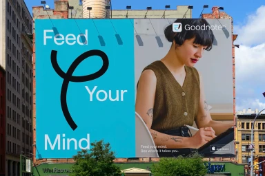
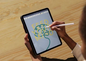
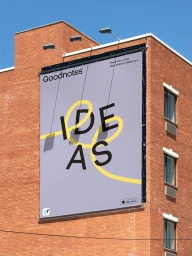
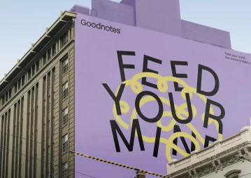
Goodnotes evolves its visual presence through a comprehensive brand identity system. The project focuses on establishing a modern digital language that bridges the gap between traditional note-taking and the app-based productivity landscape. By leveraging minimalist design principles and precise kinetic typography, the work creates a cohesive aesthetic that remains consistent across varied touchpoints. Execution features a vibrant color palette, including signature hues like seafoam and lavender, applied across both digital UI and large-scale environmental graphics. Graphic design by Motto supports the visual framework, which integrates fluid motion graphics and structured grid systems. The branding centers on clarity and functionality, utilizing the Roobert typeface to maintain a clean, accessible look. From urban billboard campaigns and building murals to app-specific animations, the identity system emphasizes fluid connectivity and user-centric design.
Horizontal, Commercial, Clean
Motion Graphics
Brand Film / Corporate Video
