Fortis: Brand Identity
Apr 2023
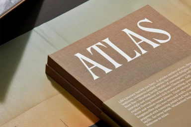
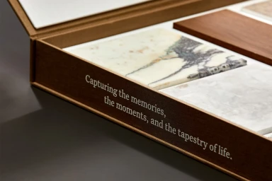
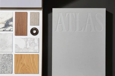
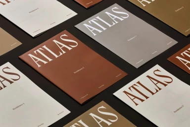
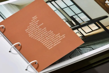
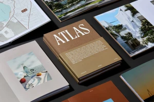
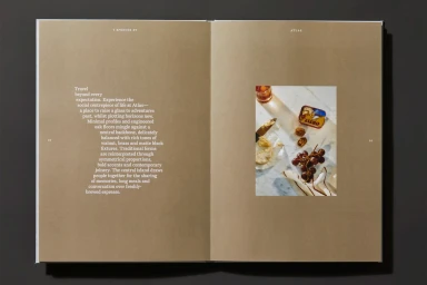
The brand identity for Fortis, titled Atlas, manifests as a comprehensive material suite designed to communicate architectural precision and refined living. Under the creative direction of Emily Matthews, the project employs a minimalist approach to print production, utilizing earthy, muted tones and tactile paper stocks to establish a premium physical presence. Graphic design by Elizaveta Pogossov anchors the visual system, utilizing elegant serif typography and clean layouts to present architectural concepts and coastal motifs. The execution relies on high-end print techniques, including precise embossing, to highlight the material qualities of the brand's documentation. Captured by photographer Saskia Wilson with styling by Nat Turnbull, the identity is showcased through a series of editorial still lifes. These compositions emphasize natural light and macro textures, focusing on the intersection of marble, timber, and matte paper, reinforcing a cohesive and sophisticated aesthetic across the entire portfolio.
Horizontal, Commercial, Clean
Typography