
Fatking: Brand Identity
Jun 2017
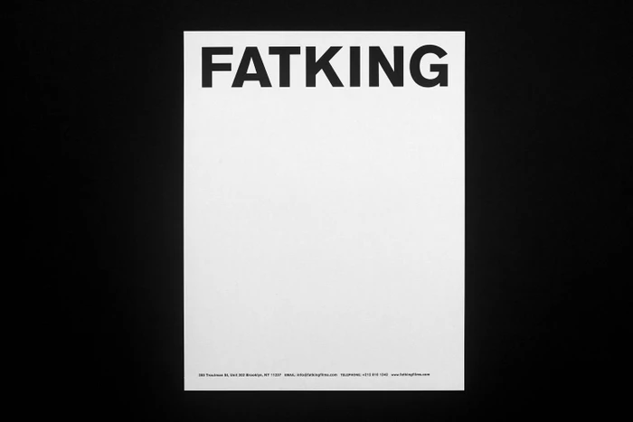
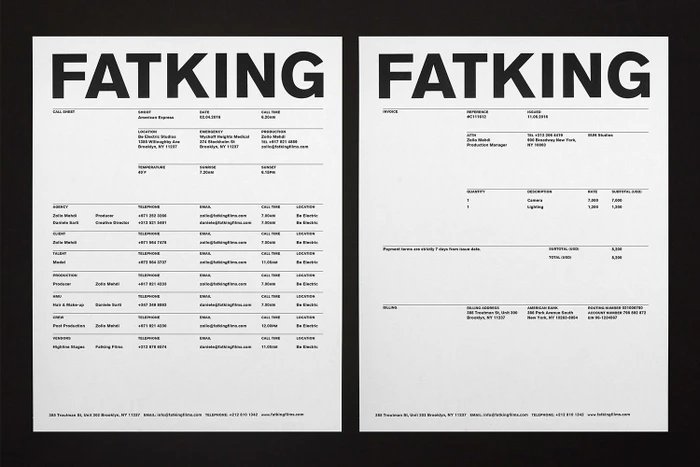
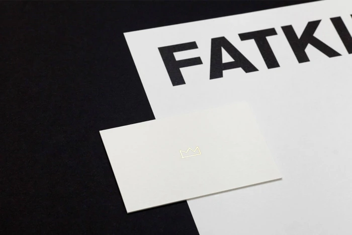
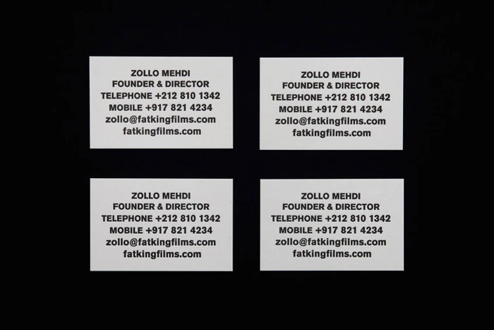
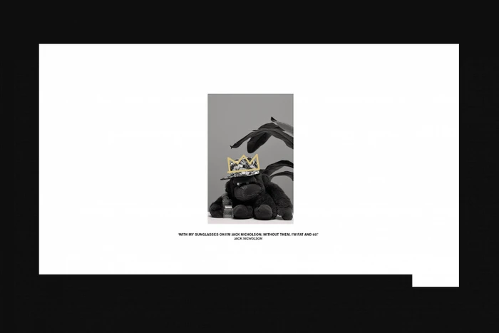
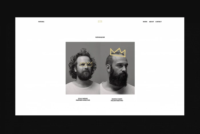
The new brand identity for Fatking establishes a distinct visual language that masterfully balances corporate rigor with a touch of whimsical flair. Executed by Zé Studio, the project leans into a high-contrast, monochromatic palette that anchors the brand in a space of professional reliability while allowing for expressive, unconventional accents. Across a suite of collateral—ranging from essential production call sheets and itemized invoices to refined business stationery and digital interface designs—the aesthetic remains consistently grounded in minimalist graphic design. The use of bold, sans-serif typography serves as a structural backbone, ensuring that the brand feels both authoritative and approachable. A recurring golden crown motif functions as a clever, subversive signature, appearing as both a tactile gold-foiled icon on physical cards and a playful hand-drawn overlay on portraits of founders Zollo Mehdi and Daniele Sarti. By pairing this crisp, corporate utility with conceptual elements, such as the evocative imagery of a plush gorilla, the identity creates a memorable tension between serious production capability and creative personality. The deliberate use of negative space and clean studio strobe lighting emphasizes a high-end, editorial feel that positions Fatking not just as a service provider, but as a thoughtfully curated studio. This branding exercise successfully translates a multifaceted commercial operation into a cohesive, design-forward visual narrative that communicates clarity, purpose, and a sharp eye for detail.
Commercial, Minimalist, Horizontal, Clean
Typography
Website / Web
