
Éditions: Brand Identity


Jul 2017
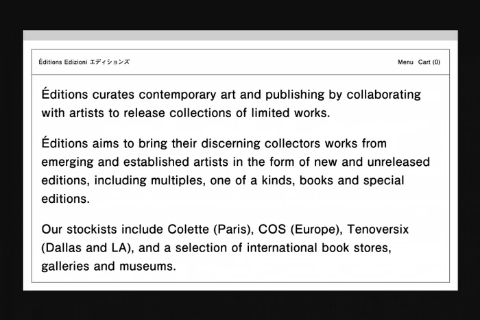
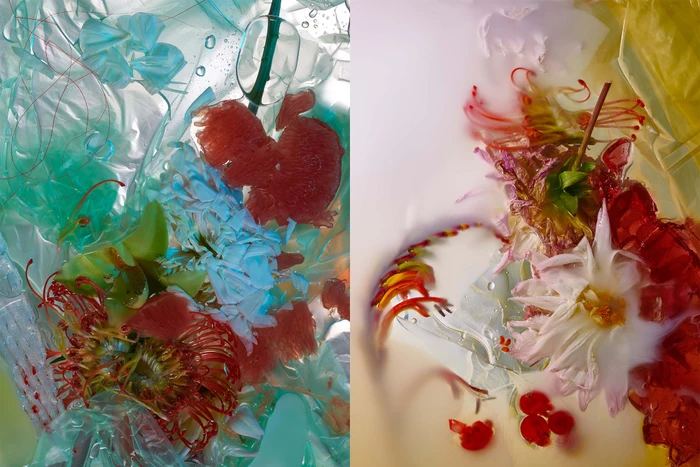
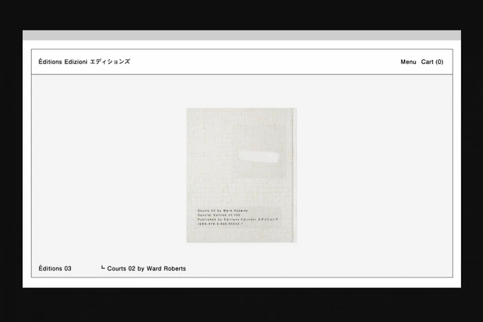
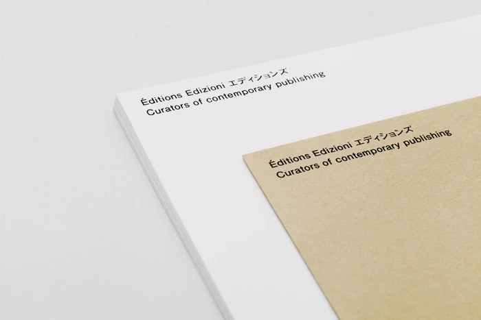
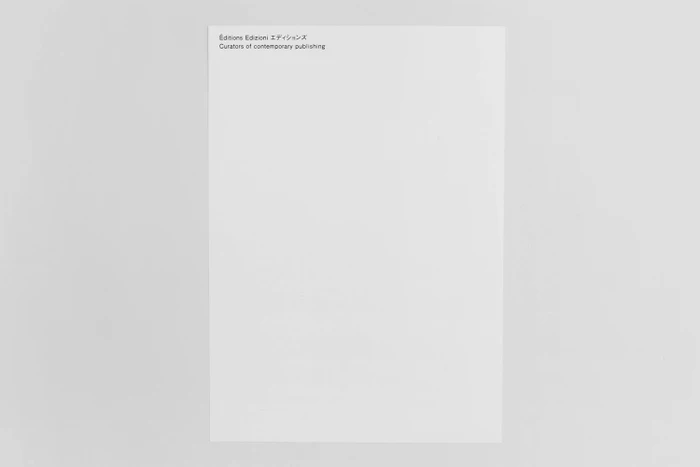
The brand identity for Editions marks a masterclass in editorial minimalism, establishing a visual language that feels as much like an art gallery as it does a contemporary publishing house. Executed by Zé Studio, the project leans into a restrained, sophisticated aesthetic where negative space and precision typography become the primary conduits of the brand's identity. By anchoring the design in a stark palette of black and white, the studio ensures that the focus remains squarely on the curated content, balancing functional UI design with an elevated, institutional feel. This corporate identity is further softened by a series of abstract, fine art photographic explorations that juxtapose organic floral forms—such as protea and orchids—with synthetic materials like translucent plastic and matte plaster. Utilizing techniques like macro photography and studio strobe lighting, these images create a tactile, multi-dimensional texture that prevents the clinical, digital-first layout from feeling overly detached. The resulting work is a study in contrasts, where the sharp, technical clarity of the web interface meets the ethereal, layered beauty of abstract still life. Through this deliberate tension, Zé Studio effectively crafts a brand narrative that feels both professional and deeply rooted in the nuanced world of contemporary art, ensuring Editions commands presence through subtlety and deliberate, high-end visual hierarchy.
Clean, Minimalist
