
Cake Wines
Brand Identity
Jul 2017
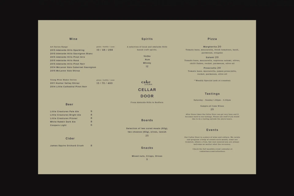
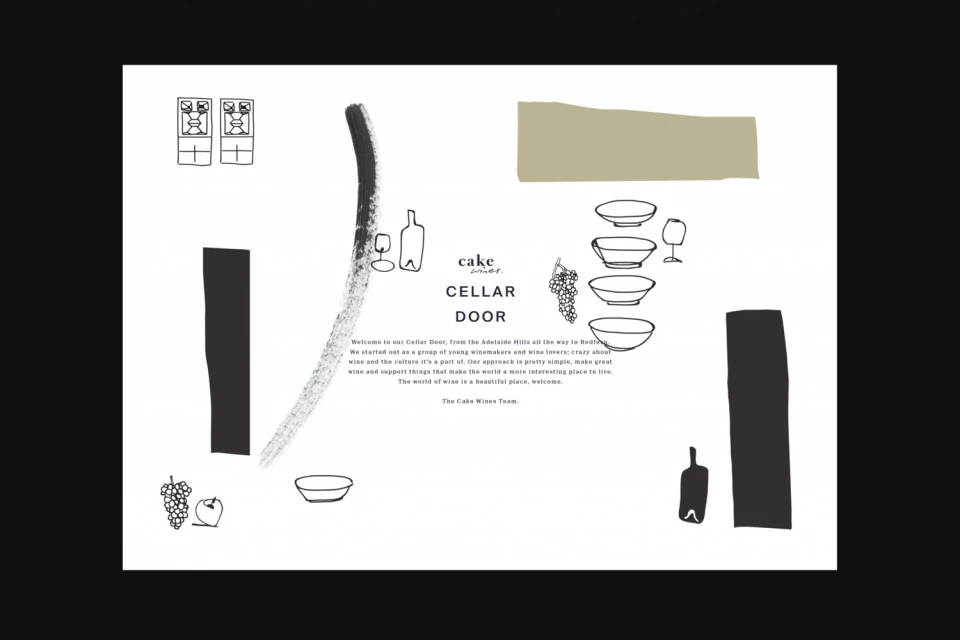
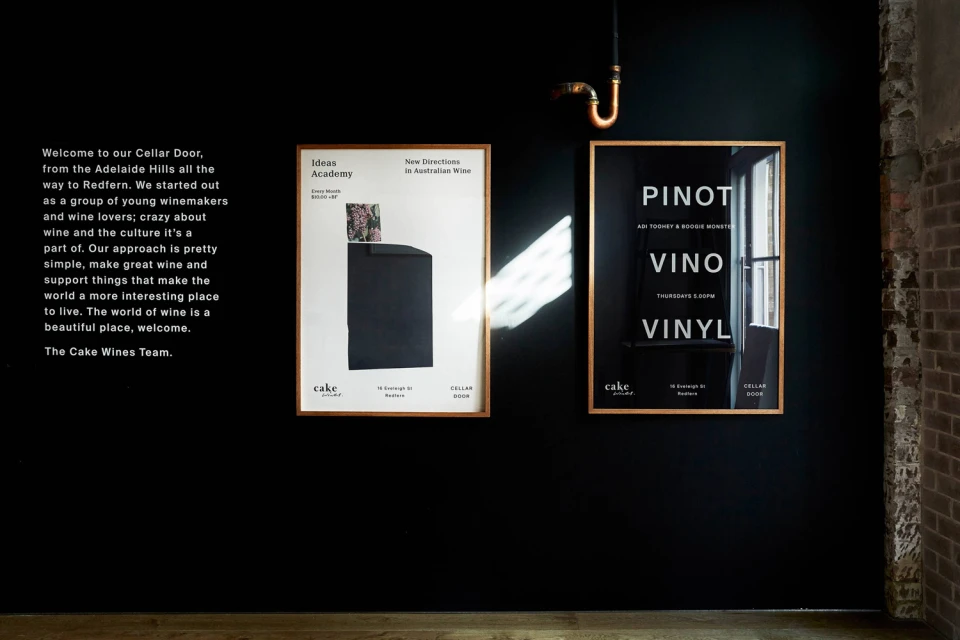
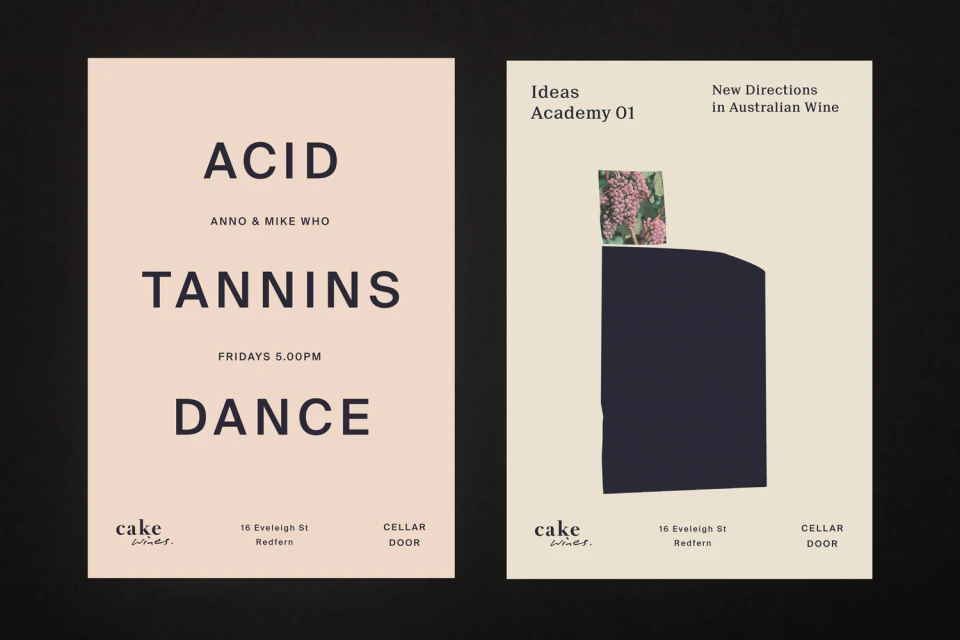
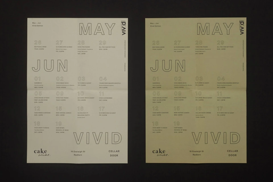
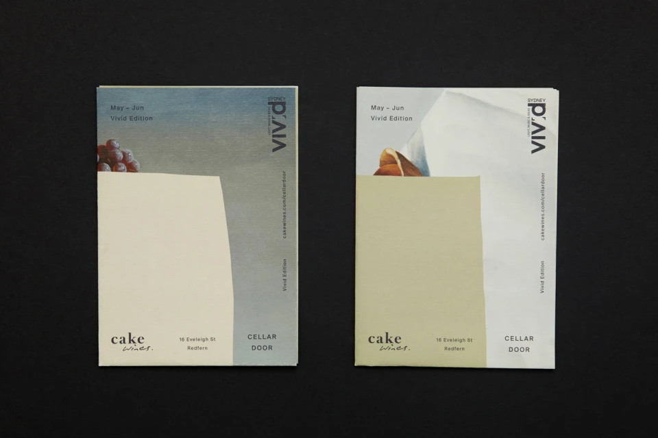
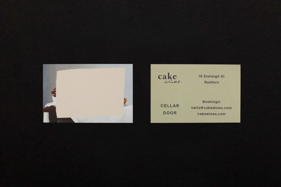
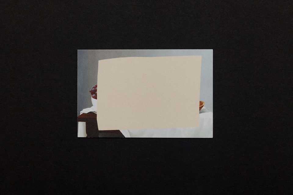
For Cake Wines, establishing a compelling brand identity required a delicate balance between the approachable spirit of a cellar door and the refined sensibilities of contemporary design. Executed with precision by Zé Studio, this project transcends standard hospitality collateral, leaning into a sophisticated, editorial minimalism that defines the brand presence across multiple touchpoints. The visual language utilizes a restrained, neutral palette of sage greens, muted beiges, and stark blacks, anchored by bold, sans-serif typography that demands attention through effective use of negative space. The execution is deeply rooted in modern graphic design, blending commercial rigor with artistic flair. From the menu layouts for their Redfern location to the event-specific posters and brochures for Vivid Sydney, the design system employs vector-based illustrations and tactile collage techniques to build a cohesive narrative. By layering paper cutouts over still-life imagery and integrating hand-drawn line art, the project bridges the gap between classic fine art aesthetics and modern corporate branding. This approach ensures that every printed material—whether a business card or an event calendar—feels like a deliberate contribution to a broader, curated brand ecosystem. The result is a clean, highly legible, and distinctly professional identity that positions Cake Wines as a forward-thinking player within the alcoholic beverages and hospitality landscape, successfully synthesizing structure with organic, artistic expression.
Horizontal, Commercial, Clean, Minimalist
Typography
Alcoholic Beverages
Advertising Campaign
