
Design Sweden
Brand Identity
Mar 2017
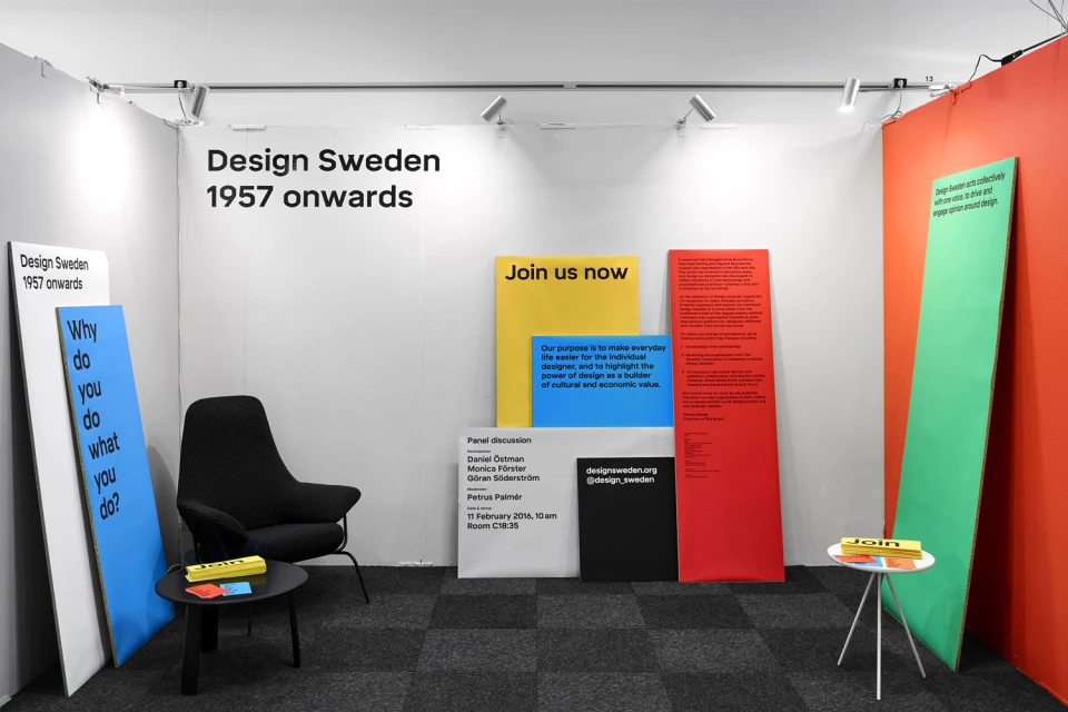
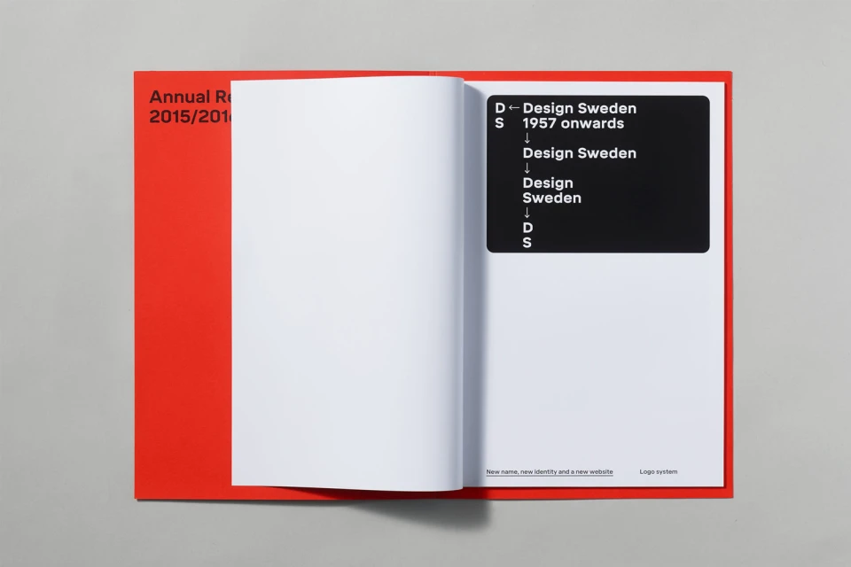
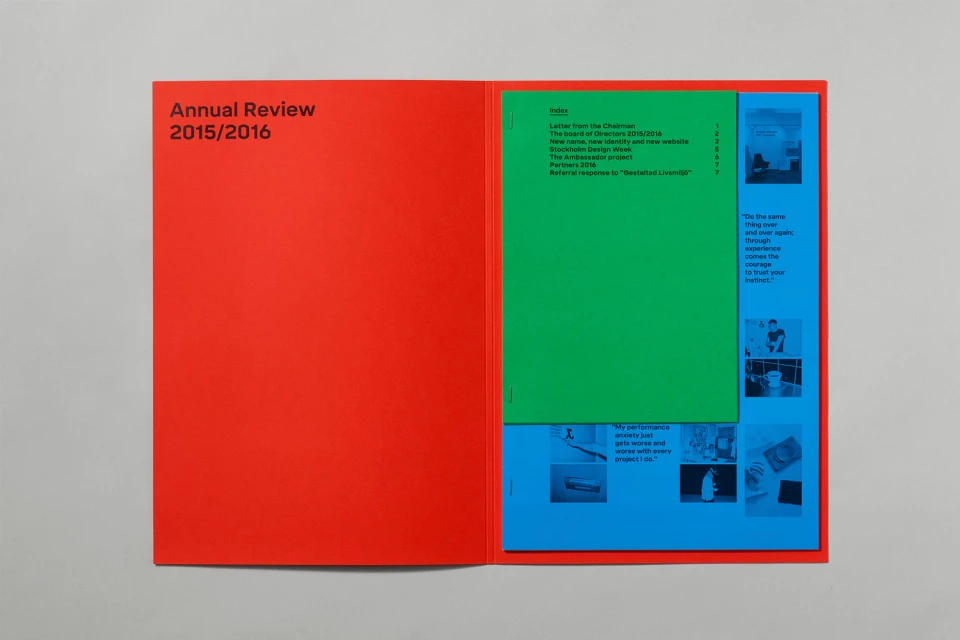
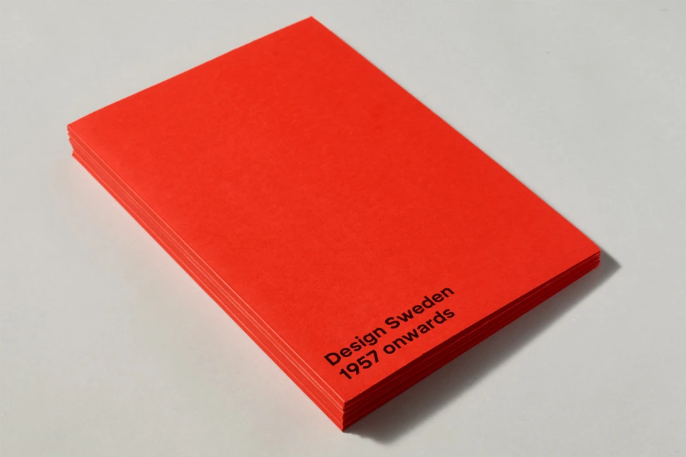
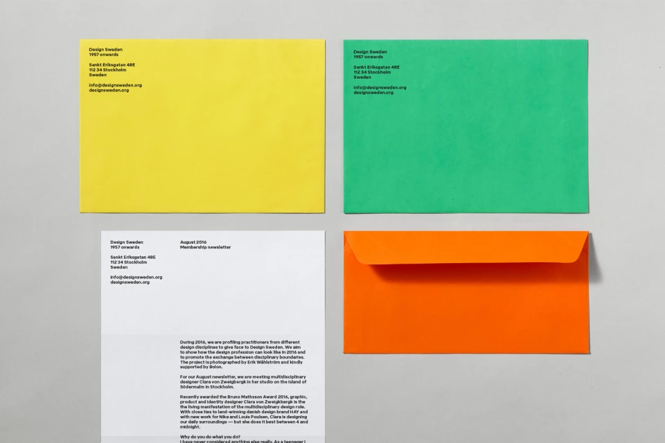
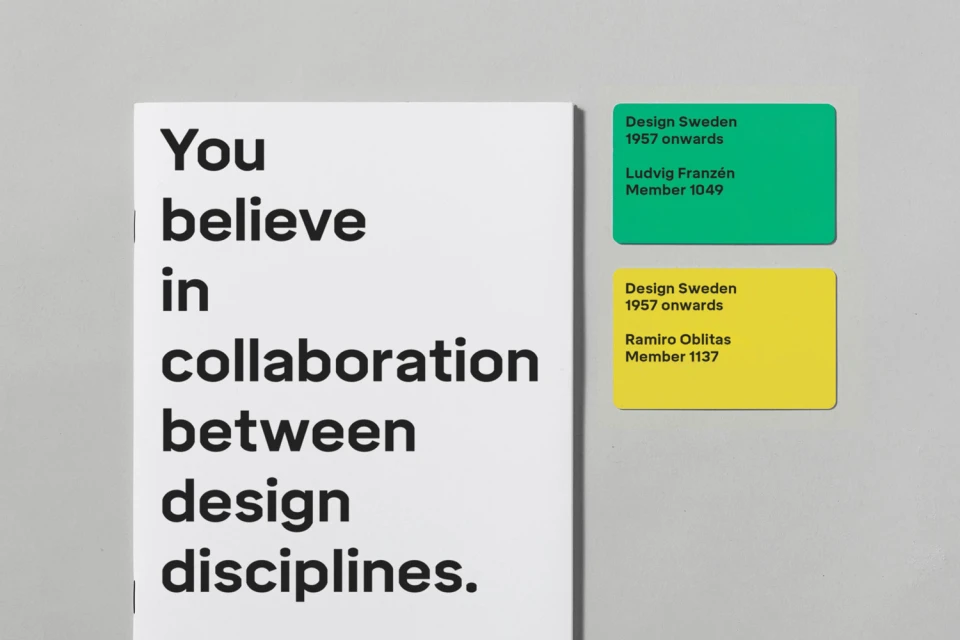
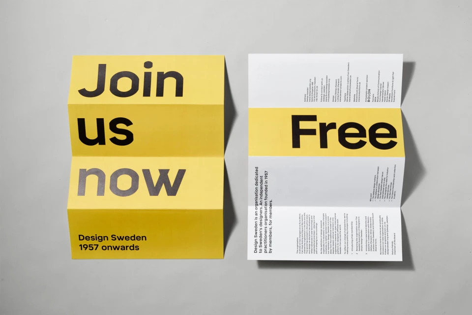
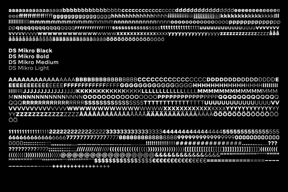
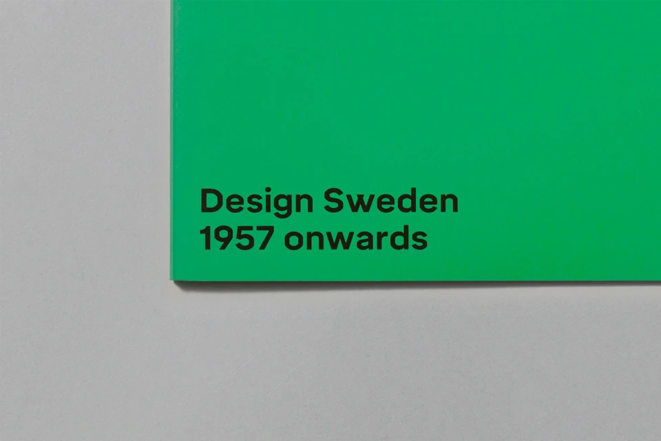
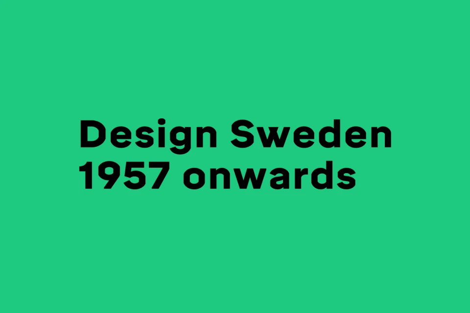
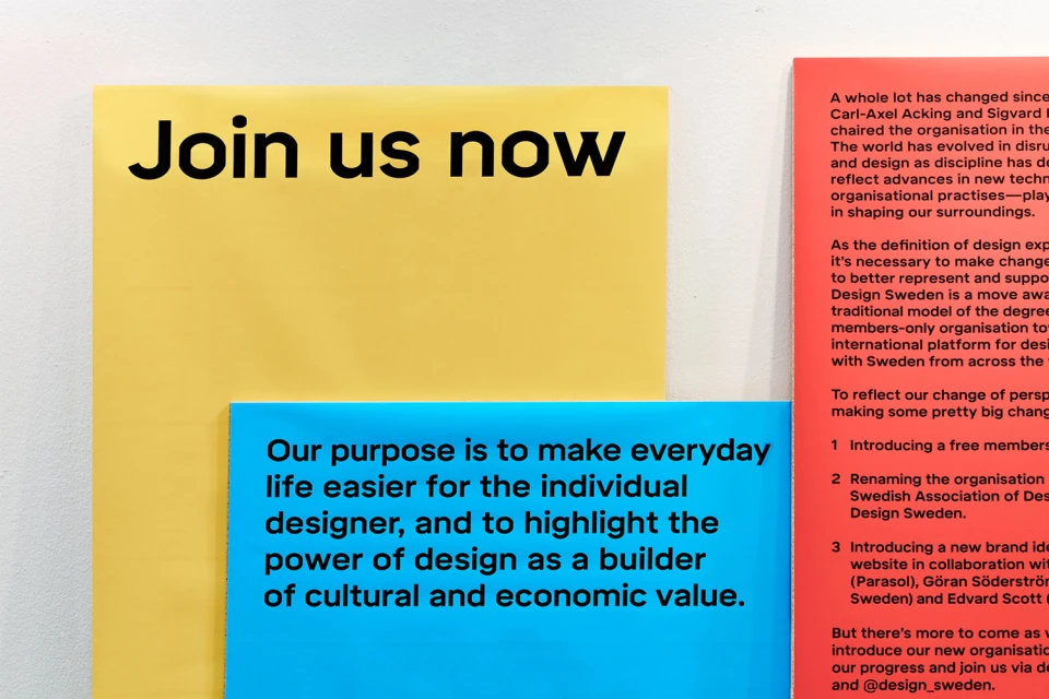
Design Sweden has unveiled a comprehensive brand identity that masterfully channels the organization's legacy, which spans back to 1957, through a lens of contemporary editorial design. Executed with precise graphic design expertise by the team at Parasol, the project leans into a bold, primary-colored palette of red, blue, green, and yellow to create a striking visual system. The identity relies heavily on typography, featuring the bespoke DS Mikro typeface family, which offers functional versatility across varying weights from light to black. The collateral, ranging from corporate annual reports and membership stationery to exhibition booth installations, is unified by a minimalist layout that prioritizes clear information hierarchy and high-contrast color blocking. Techniques such as clean studio strobe lighting and precise vector composition ensure that every element—from the layered brochures to the technical specimen sheets—feels intentional and professional. By utilizing sharp, sans-serif typography set against stark, neutral backgrounds, the work avoids unnecessary ornamentation, instead focusing on the tactile quality of matte paper and the rhythmic arrangement of modular information panels. This project stands as a sophisticated example of corporate branding, demonstrating how a disciplined grid system and intentional color usage can modernize an established institution while maintaining a clean, highly readable, and distinctly modern aesthetic across all digital and physical media touchpoints.
Horizontal, Commercial, Clean, Minimalist
Typography
Grey Seamless
