
Björk & Berries
Brand Identity
Mar 2017
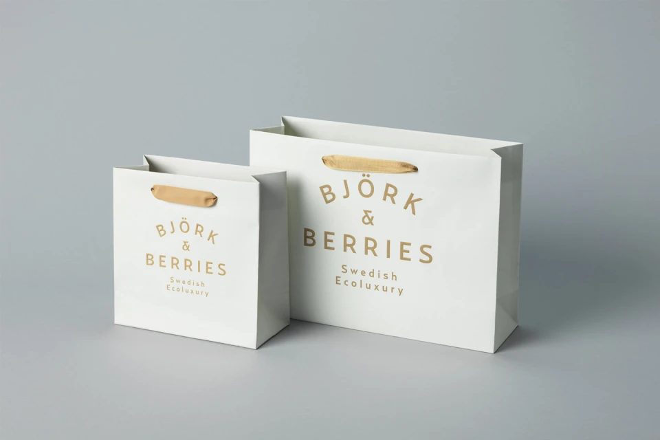
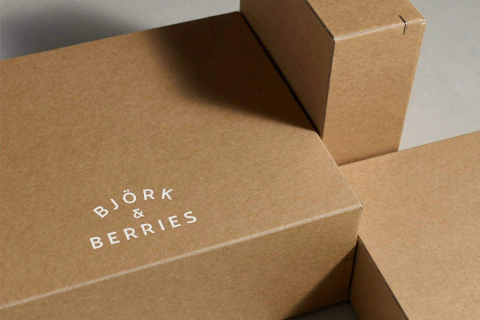
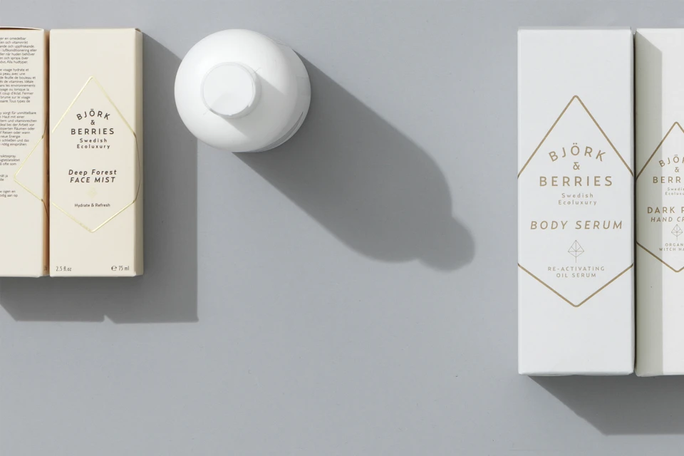
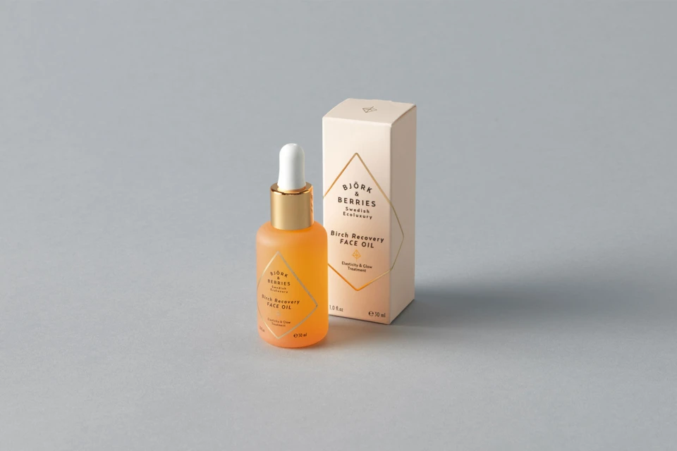
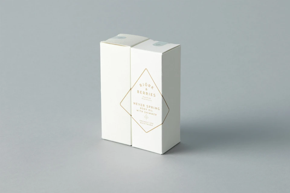
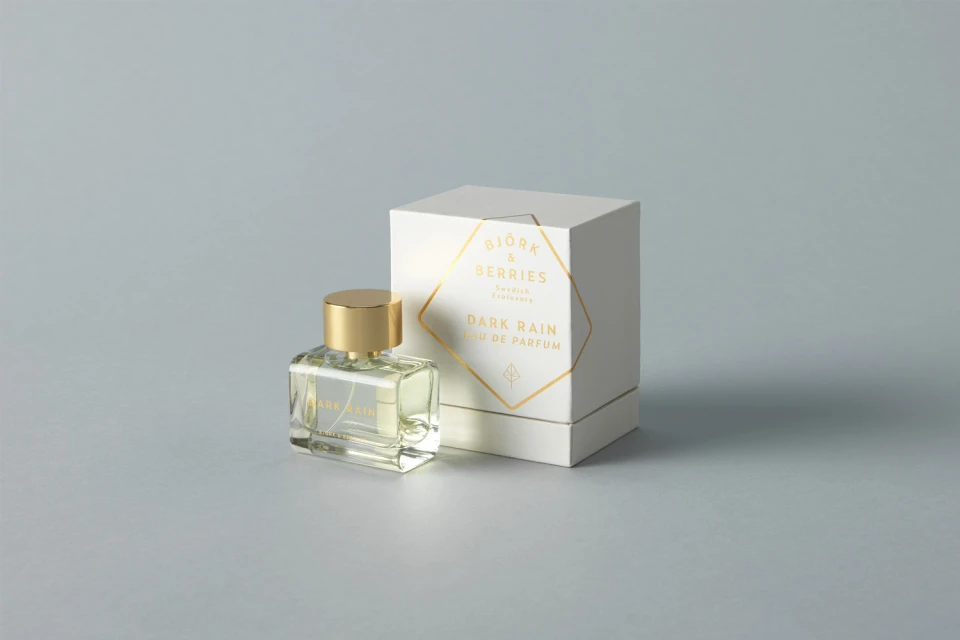
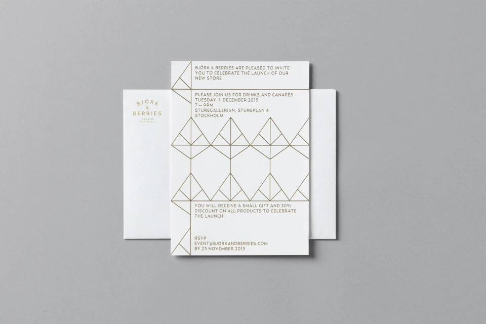
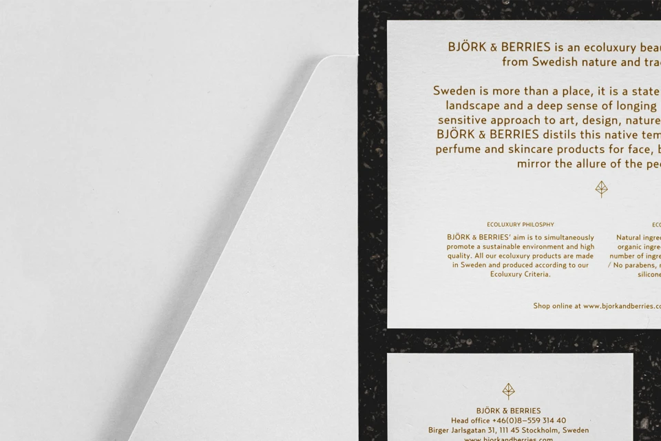
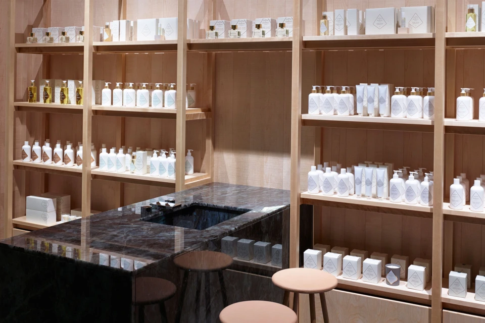
In the competitive landscape of Swedish Ecoluxury, Björk & Berries has established a brand identity that leans into a sophisticated, minimalist aesthetic, effectively translating its core values into a cohesive visual language. This comprehensive branding initiative, spearheaded by the team at Parasol, prioritizes clean lines and a restrained color palette to mirror the clinical yet premium nature of the company's skincare and beauty offerings. Through a deliberate application of studio strobe lighting, the project captures the interplay between matte paper textures and the high-contrast elegance of gold-foiled geometric typography. The execution spans across diverse touchpoints—from retail packaging and corporate stationery to the interior design of their organized, light-filled retail environments. By utilizing intentional negative space and modern, sans-serif typefaces, the identity communicates a sense of refined transparency and precision. Each element, whether it is a frosted glass bottle or a geometric store invitation, serves as a testament to an overarching philosophy of understated luxury. This project functions not just as a visual update, but as a strategic alignment of product presentation with the brand’s promise, ensuring that every consumer touchpoint reflects a professional, high-end experience that resonates deeply with a design-conscious audience. The result is a unified, timeless identity that elevates the everyday ritual of self-care through impeccable graphic design and thoughtful, balanced composition.
Horizontal, Commercial, Clean, Minimalist
Fragrance
Grey Seamless
E-commerce / Product
