
Denada: Brand Identity

Mar 2020
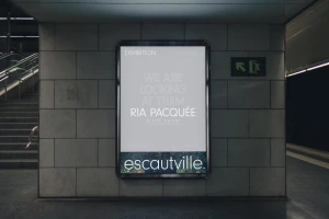
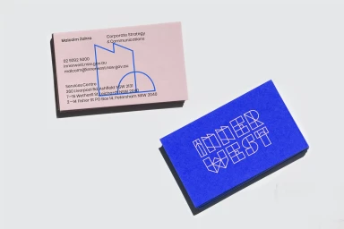
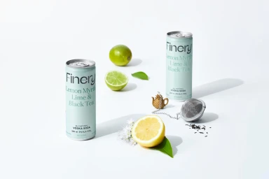
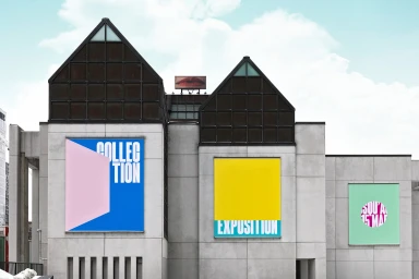
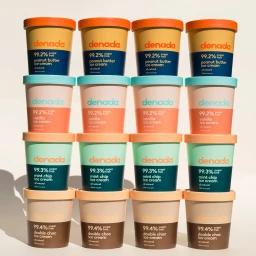
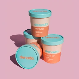
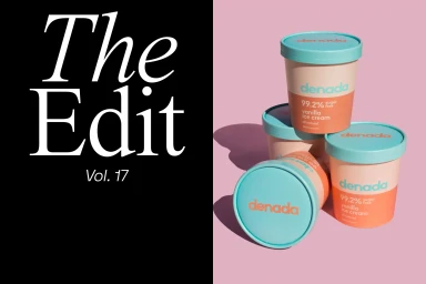
The brand identity work for Denada presents a masterclass in modern commercial design, where minimalist graphic design principles meet high-contrast visual storytelling. By synthesizing a cohesive system of color-blocked packaging and bold, sans-serif typography, the project transforms everyday sugar-free ice cream containers into striking, sculptural elements. The creative execution leverages hard light and crisp directional shadows to emphasize the geometric forms of the product, moving beyond simple packshots to create a dynamic, modern aesthetic. This approach is further articulated through a broader visual language that extends into environmental signage and print collateral, showcasing a versatility that shifts seamlessly between corporate stationery and artistic, gallery-grade exhibition posters. Techniques such as macro photography and carefully balanced natural light ensure that the focus remains entirely on the brand’s tactile quality and refined color palettes of mint, teal, and soft peach. With contributions from creative agencies including Jo Curti Studio, Caserne, Onfire Design, For The People, and ssnn, the identity leans into a clean, grid-based composition that feels both approachable and highly sophisticated. Whether capturing the vibrant stack of pint-sized tubs or the precise layout of a subway billboard, the project demonstrates how deliberate typography and consistent brand architecture can define a market presence that is as aesthetically rigorous as it is commercially effective, anchoring the brand in a contemporary, design-forward space.
Commercial, Clean, Horizontal


