
Brand
ProjectBrand Identity
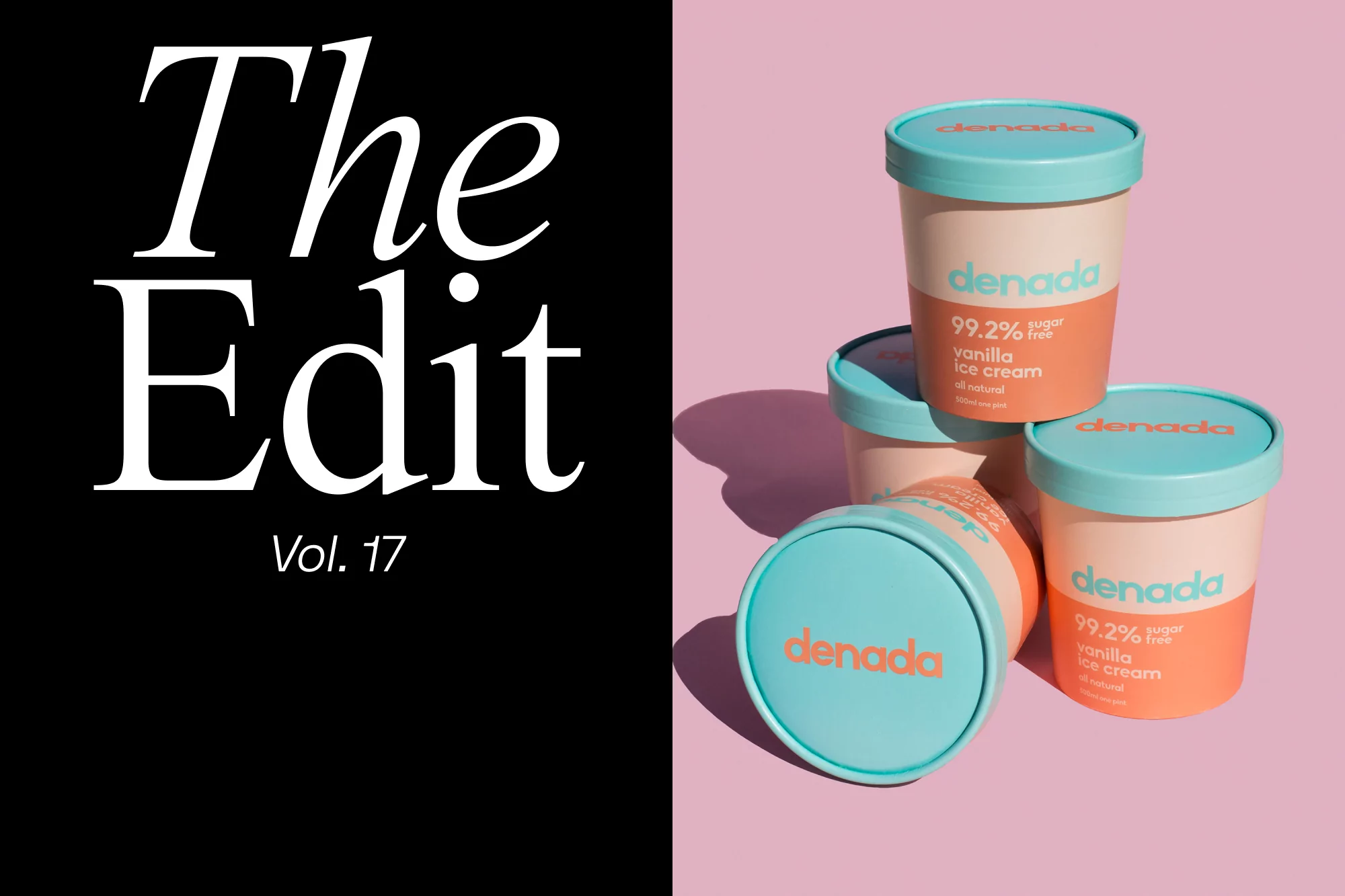
Denada Brand Identity 2020
Associated creatives


Tags
Description
This split-composition image features bold white editorial typography reading "The Edit Vol. 17" against a solid black panel on the left. The right side displays a stack of four Denada ice cream tubs with bright turquoise lids and peach-and-orange branded packaging set against a soft pink background. The lighting creates sharp, clean shadows cast toward the left side of the frame. The design highlights modern product packaging aesthetics with vibrant pastel contrast. The project was created for the Brand Identity project under the brand name Denada.