
Cidres Polisson: Brand Identity
Sep 2019
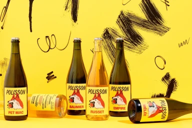
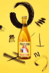
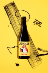
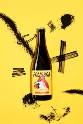
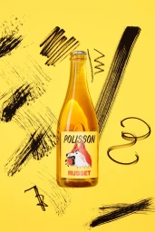
The brand identity for Cidres Polisson marks a refreshing departure from traditional beverage aesthetic, channeling a high-energy and graphically bold approach that demands attention on the shelf. By utilizing a striking, saturated yellow backdrop, the project leans into a clean and minimalist composition that highlights the amber-toned liquid within the glass while allowing the sophisticated label illustrations to take center stage. The integration of a stylized fox and wolf motif adds a playful, character-driven layer to the branding, effectively bridging the gap between artisan craftsmanship and modern appeal. Executed with a sharp focus on commercial typography, the visual language is elevated by expressive, dry-brush ink marks and gestural black strokes that provide a dynamic, hand-drawn texture against the flat, vibrant background. This artistic contrast creates a cohesive look across the entire range, including Pet Mac, Baumier, Russet, and Empire labels. With expert graphic design work by Caserne, the identity moves beyond standard product photography, employing an editorial minimalism that makes the packaging feel both tactile and contemporary. The overall result is an immersive visual system that feels as spirited as the product itself, utilizing natural light and high-contrast vector elements to ensure that Cidres Polisson commands a distinct presence within the competitive alcoholic beverages industry.
Commercial, Clean, Graphic, Vertical
Solid Colour
E-commerce / Product
