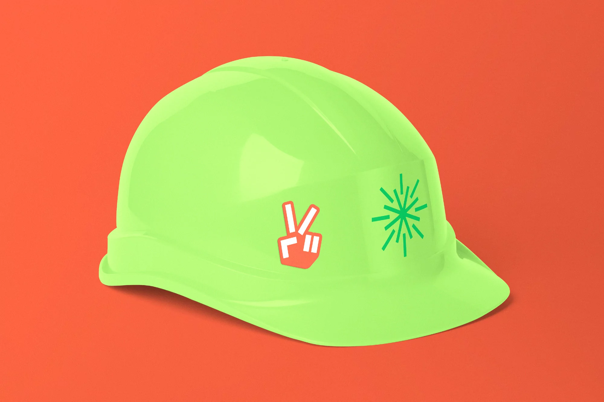
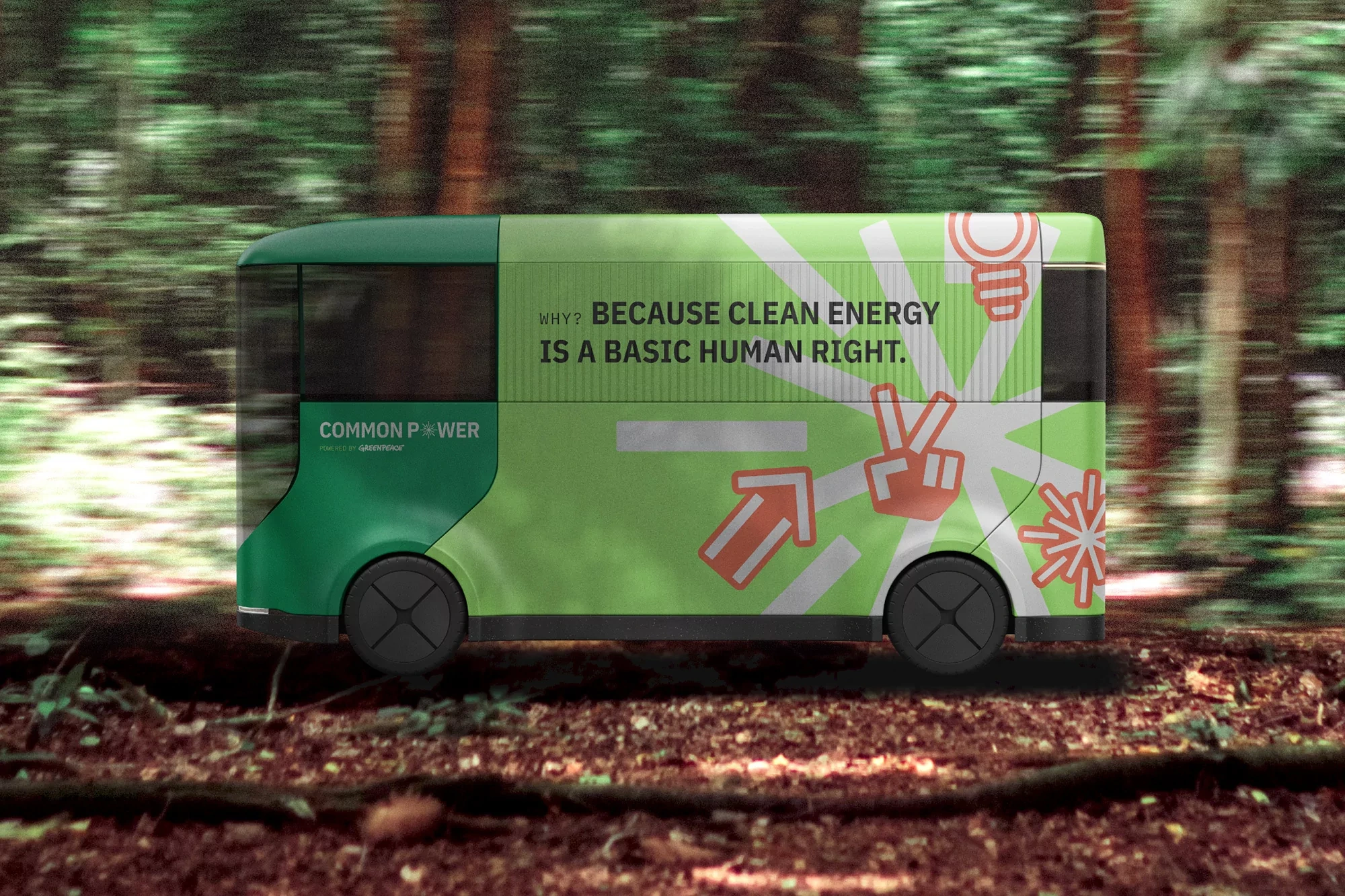
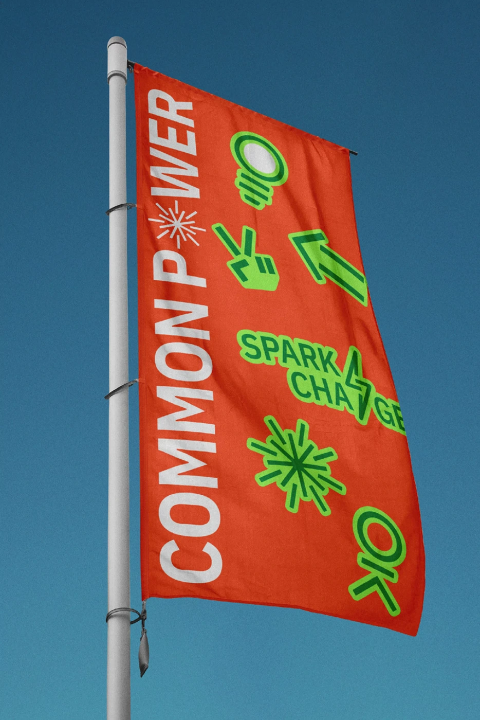
Human After All developed the brand identity for Common Power, focusing on a visual system that combines industrial utility with community-driven environmental advocacy. The project utilizes a vibrant color palette of lime green and orange to unify diverse touchpoints, from signage and product applications to editorial posters.
Techniques such as 3D rendering, tactile embroidery, and clean typography anchor the visual language, presenting the brand across both physical and digital spaces. The identity incorporates recurring graphic motifs—including starburst symbols and lightbulb icons—to bridge the gap between technical infrastructure and accessible communication.