
Brooklyn Org: Brand Identity


Brand
Date
Mar 2024
Description
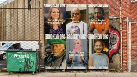
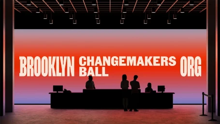
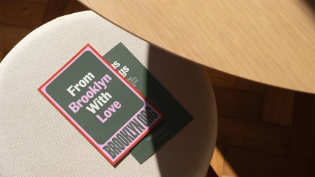
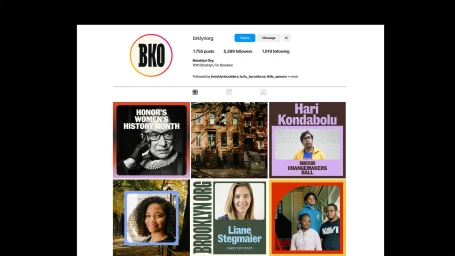
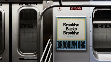
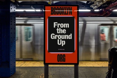
Mother Design developed a comprehensive brand identity for Brooklyn Org, centering on a system that reflects the borough’s architectural character and community focus. The project utilizes bold typography and a neighborhood-inspired color palette, featuring custom tones like Cobblestone and Blacktop to anchor the visual language. The identity spans diverse touchpoints, from public interest advertising in subway cars and outdoor posters to digital brand presentations and social media assets. The execution leans into clean, minimalist graphic design, employing motion graphics to animate the typography across various environmental and digital contexts.
Style
Horizontal, Commercial, Clean
Associated creatives

5000+ creatives to discover
Sign up to gain access to the entire directory. It’s free.
Visie is a curated library of creative professionals.