
it
Brand Identity

May 2026
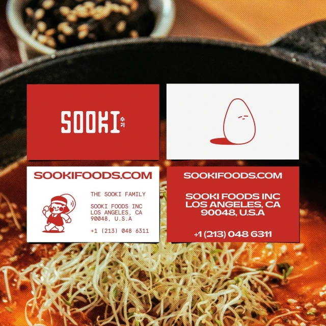
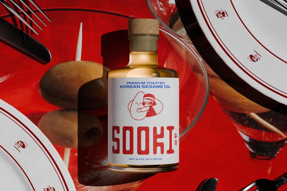
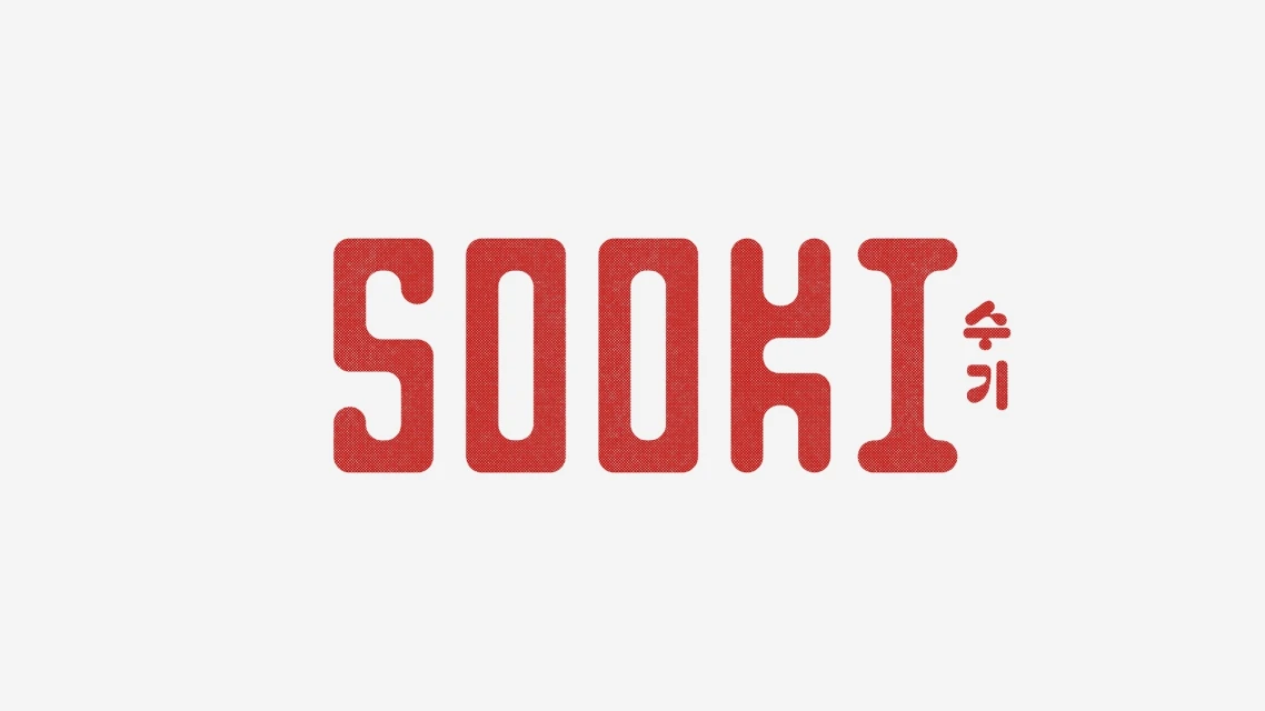
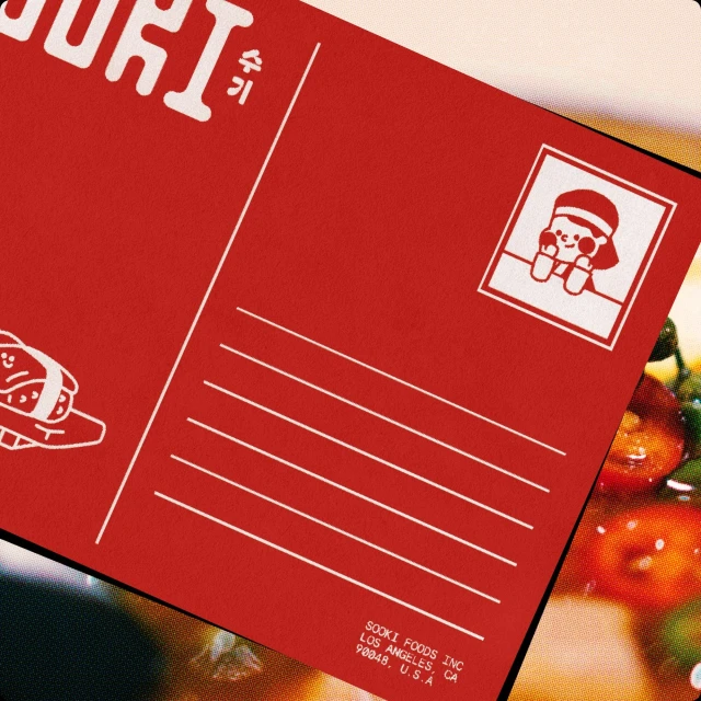
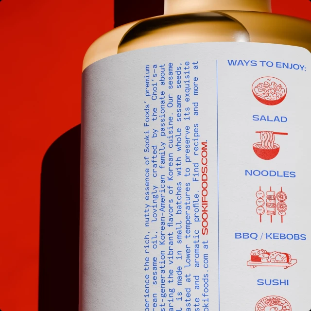
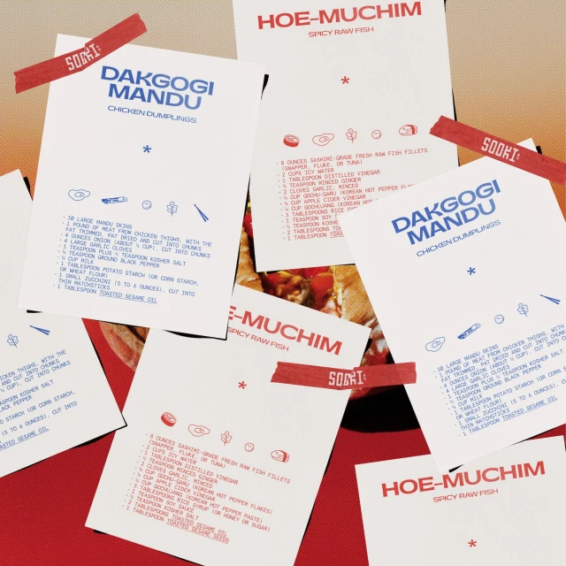
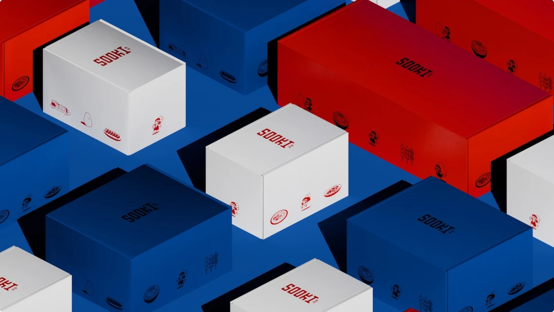
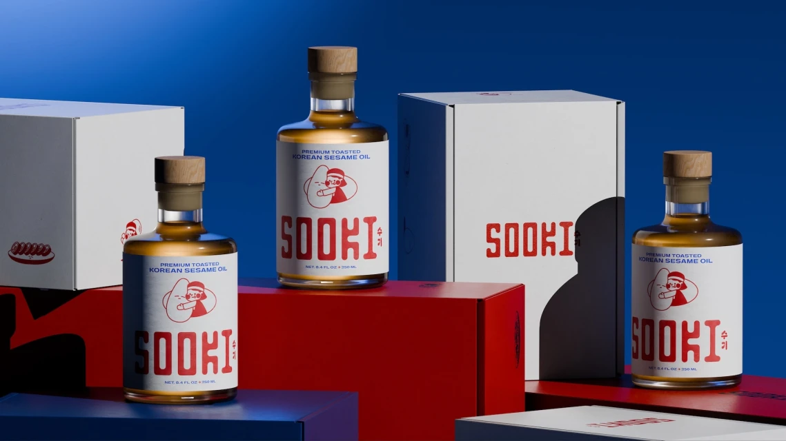
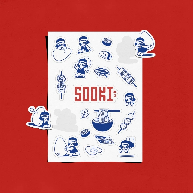
The brand identity for Sooki Foods, crafted by the design team at The Collected Works, is a masterclass in modern, high-contrast commercial design. By leaning into a primary color palette of deep red, royal blue, and crisp white, the project establishes a playful yet professional visual system that feels both approachable and distinct within the culinary industry. The aesthetic channels a sense of movement and approachability, utilizing bold, rounded sans-serif typography that ensures high legibility across a range of touchpoints, from delicate packaging labels to larger-scale signage. The design execution utilizes clever vector graphics and intentional screen print effects to bridge the gap between traditional food branding and contemporary lifestyle appeal. Throughout the identity, the use of stylized line-art illustrations and recurring cartoon mascots injects a sense of personality into the brand, while macro photography of ingredients provides the necessary textural depth to ground the graphic elements in a real-world context. Whether seen on an isometric grid of product boxes or a meticulously arranged set of recipe cards, the work maintains a consistent, modular language. By balancing sharp, direct studio strobe lighting with minimalist composition, the team has successfully built an identity that feels curated, versatile, and highly memorable, offering a refreshing take on consumer-packaged goods through its clever application of graphic minimalism and vibrant, tactile storytelling.
Commercial, Clean, Horizontal, Graphic
Typography
