Boetiek Vincent: Brand Identity




Jul 2020
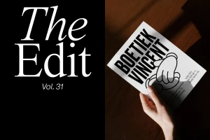
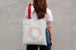
Boetiek Vincent defines a masterclass in cohesive corporate identity, showcasing how a unified visual language can seamlessly bridge the gap between digital interface design and tactile, real-world branding. Across this extensive project, the design collective—featuring collaborative contributions from Eye Studio, Carosello Lab, Bakoom Studio, Escola, and Neue—deploys a sophisticated toolkit that balances commercial precision with an approachable, human-centric aesthetic. The brand system leans into a high-contrast visual hierarchy, utilizing bold sans-serif typography that feels both modern and industrial, effectively grounding the identity against the weathered textures of urban environments like the St-Amandsberg storefront. By integrating playful UI illustration and vector graphics alongside cinematic product photography, the team crafts an experience that feels as intentional in a social media feed as it does on a physical construction fence. Technique-wise, the project thrives on the interplay between hard light and natural light, using sharp shadows and macro details to elevate everyday brand touchpoints into editorial statements. Whether through the clean, minimalist composition of a store entrance or the rhythmic layout of a digital collage, the identity system demonstrates a versatile, professional design strategy. This project successfully establishes Boetiek Vincent as a recognizable entity, proving that clarity and personality are not mutually exclusive in the competitive landscape of retail branding and corporate communication.
Clean
Advertising Campaign