
Black Isle Bakery: Brand Identity

May 2018
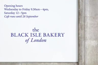
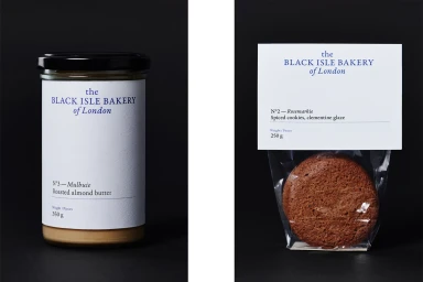
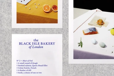
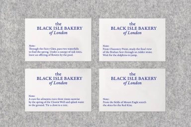
Black Isle Bakery of London has redefined its corporate identity through a masterfully executed brand identity project that bridges the gap between artisanal culinary production and sophisticated editorial design. Developed with meticulous graphic design by OK-RM, the visual language channels a refined sensibility that balances clinical precision with evocative storytelling. The project relies on a restrained color palette of deep blue against stark whites and greys, using classic serif typography to establish a professional, timeless authority. Across a range of media, from architectural signage to intimate product photography, the work leans into minimalist aesthetics and clean hierarchies to elevate simple ingredients into objects of desire. The execution features high-key lighting to accentuate textures, while the use of soft light and sharp, hard-light contrast in product shots highlights the artisanal nature of their offerings, such as roasted nut butters and spiced pastries. By integrating folklore-inspired messaging onto stationery and curated tabletop still lifes, the brand successfully positions itself at the intersection of high-end commerce and artistic expression. This corporate project serves as a compelling case study in how consistent typographic branding can unify diverse materials, creating a tactile and memorable identity that feels both established and contemporary, ultimately ensuring the bakery stands out within the competitive London culinary landscape through its unwavering commitment to clean, intentional design.
Horizontal, Commercial, Clean
Typography
Advertising Campaign
