
Patcharavipa
Brand Identity
Oct 2017
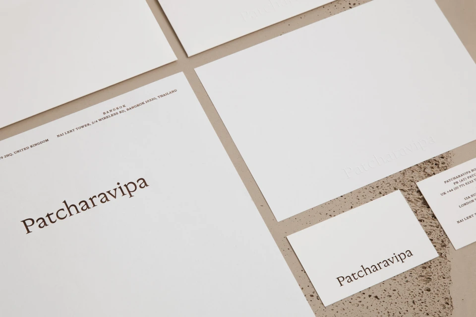
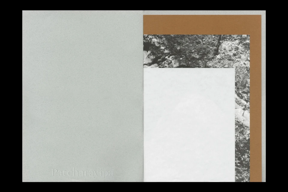
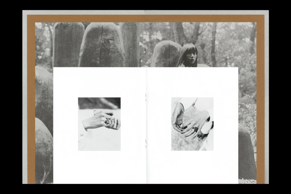
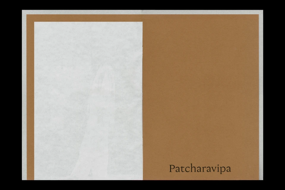
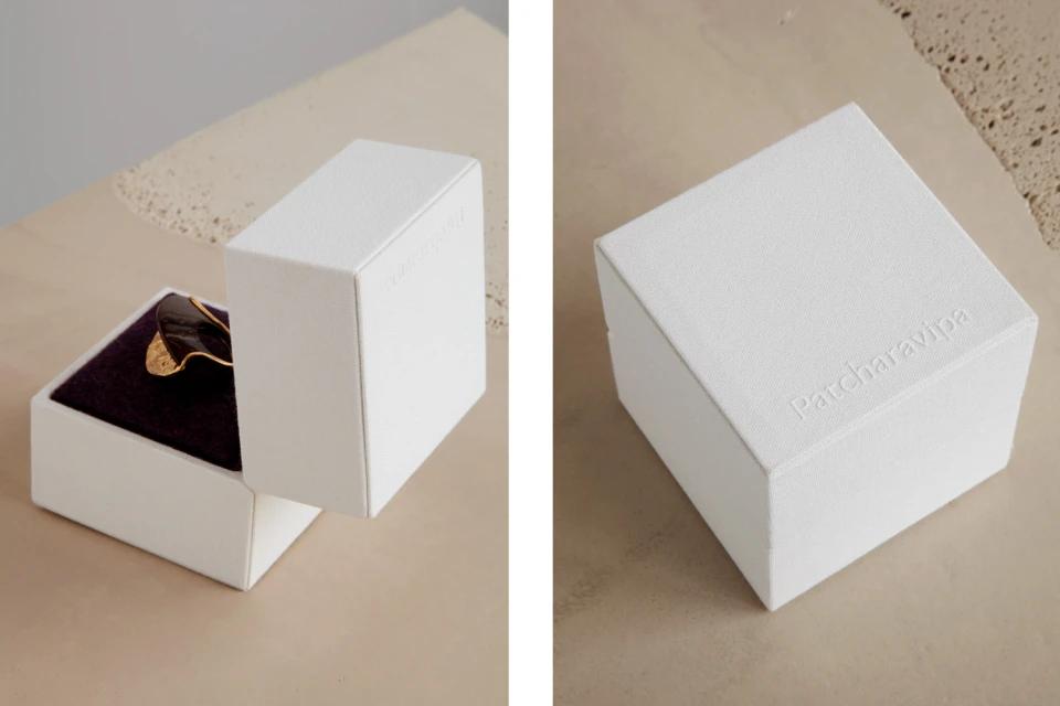
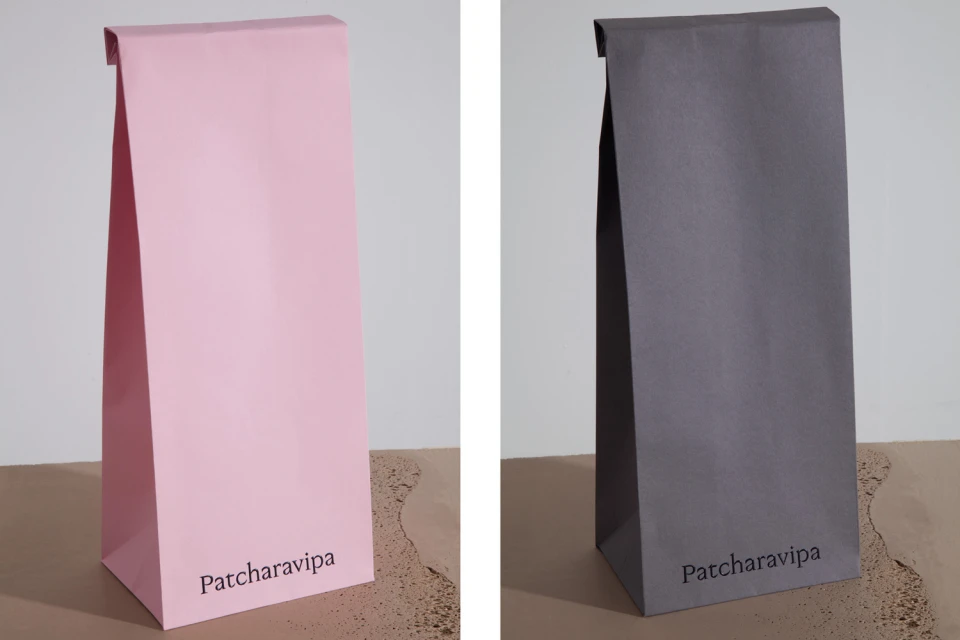
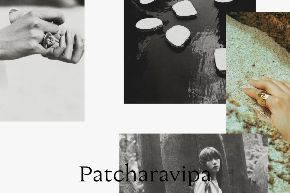
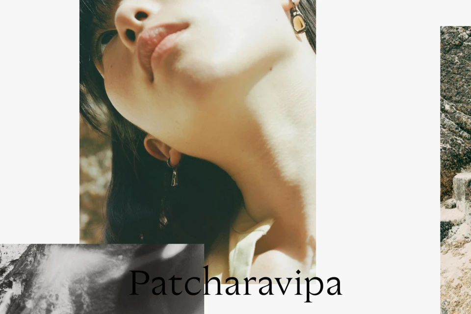
The brand identity for Patcharavipa serves as a masterclass in minimalist design, bridging the gap between high-end jewellery and editorial storytelling. Orchestrated with a sophisticated hand, the project centers on a tactile, material-focused language that prioritizes organic textures and architectural precision. Graphic design studio OK-RM brings this vision to life through a refined interplay of serif typography, embossing, and a carefully curated color palette that shifts seamlessly from muted earth tones to stark monochrome. The identity project extends beyond traditional collateral, weaving in 35mm film photography and portraiture to anchor the brand in a sense of raw, natural elegance. By juxtaposing the sharp lines of modern corporate stationery with the coarse, elemental textures of sand and rock, the design captures the essence of the jewellery itself—sculptural, timeless, and grounded in craftsmanship. Whether through the clean geometry of studio-lit packaging or the evocative, sun-drenched editorial spreads, the work leans into an aesthetic of deliberate restraint. This cohesive approach to visual identity ensures that every interaction, from the opening of a velvet-lined box to the scanning of a letterhead, resonates with the brand's commitment to quiet luxury. The result is a comprehensive, multi-layered visual language that feels both profoundly rooted in artisanal tradition and undeniably contemporary in its execution.
Horizontal, Clean, Minimalist, Editorial
Typography
Jewellery
