
Untitled: Brand Identity
May 2018
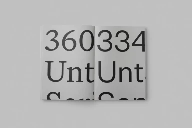
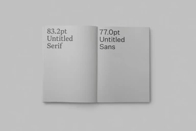
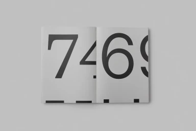
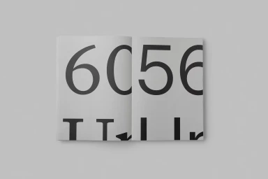
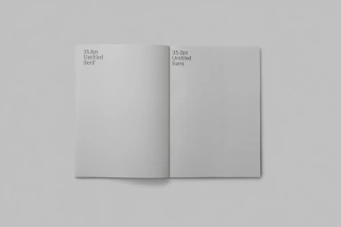
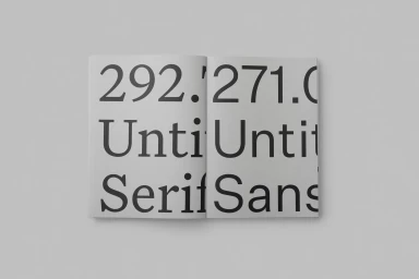
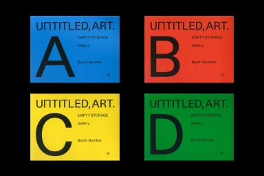
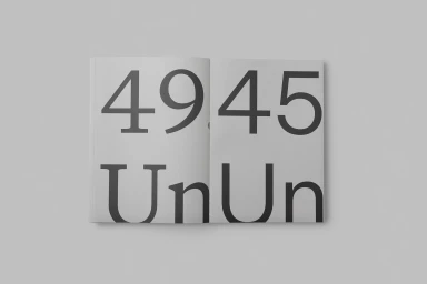
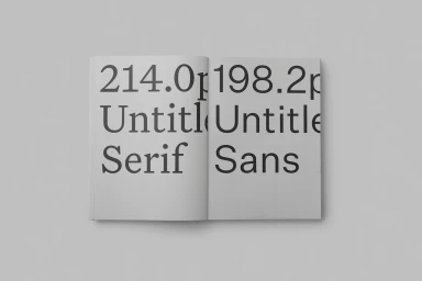
This comprehensive exploration of brand identity by the design studio OK-RM serves as a masterclass in typographic discipline and minimalist rigor. By juxtaposing the structured elegance of Untitled Serif against the geometric precision of Untitled Sans, the project functions as both a technical showcase and a sophisticated exercise in editorial design. The visual strategy relies heavily on stark monochromatic contrasts and the intentional use of negative space, allowing the letterforms themselves to dictate the rhythm of the layout. Each spread, captured through studio-grade soft light and flat-lay composition, emphasizes a clean, corporate aesthetic that prioritizes clarity and legibility above all else. Whether displaying numerical sequences or complex typeface hierarchies, the work maintains a clinical, modern sensibility that strips away extraneous detail to focus on the essential architecture of brand communication. The inclusion of vibrant, color-blocked signage templates further demonstrates the versatility of this design system, proving its efficacy across both printed collateral and exhibition wayfinding. Ultimately, this collection of assets offers a refined approach to identity, demonstrating how professional graphic design can achieve profound impact through balance, scale, and an unwavering commitment to typography. It is an exercise that highlights the power of quiet, deliberate composition in the modern landscape of commercial identity design.
Horizontal, Clean, Minimalist
Typography
Grey Seamless
Editorial
