
Brand
ProjectBrand Identity
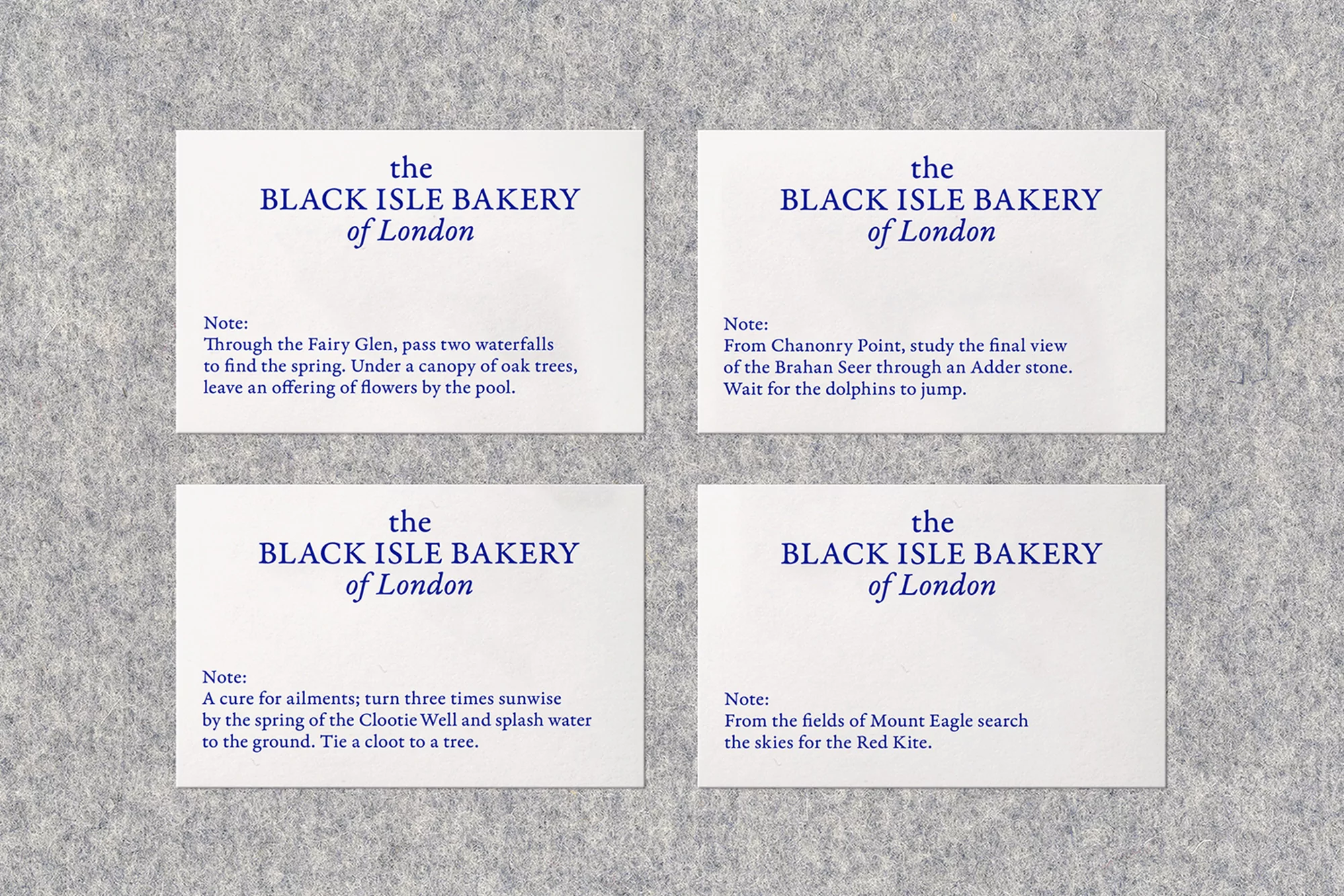
Black Isle Bakery Brand Identity 2018
Associated creatives

Tags
Description
Four white rectangular cards featuring blue typography are arranged in a clean grid formation on a textured grey felt surface. Each card displays the Black Isle Bakery of London branding alongside short descriptive notes printed in a serif font. The clean composition highlights the graphic design work by OK-RM for the Brand Identity project. The lighting is soft and even, casting subtle shadows that emphasize the tactile quality of both the paper cards and the felt background.