
BIRI: Brand Identity
Jan 2022
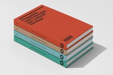
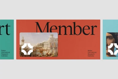
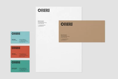
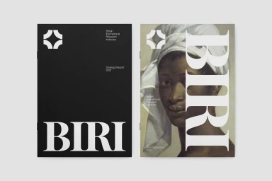
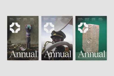
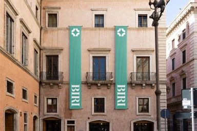
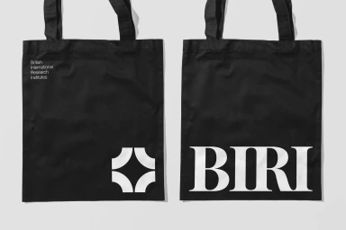
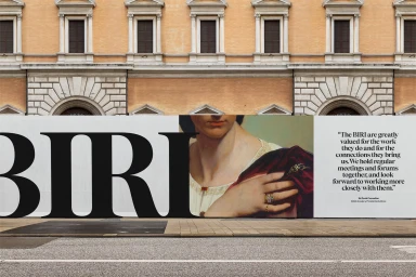
The brand identity for BIRI, developed by Only, establishes a cohesive visual language through minimalist typography and a structured editorial system. The project encompasses a versatile range of assets, including print stationery, exhibition banners, and publication design, all grounded in a clean aesthetic that utilizes bold serif type and geometric logo marks. Beyond traditional print, the identity extends into large-scale exterior installations and dynamic video content that integrates cinematic imagery of architecture and historical artifacts. By employing a consistent palette and grid-based layouts, the brand system bridges contemporary corporate design with traditional institutional elements across physical and digital formats.
Horizontal, Commercial, Clean, Minimalist
Typography
