
Bike-Mailorder: Brand Identity


Nov 2020
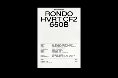
Bike-Mailorder establishes a new visual language for its cycling retail experience with this comprehensive brand identity project. The work leans into a clean, minimalist aesthetic, using bold typography and technical graphic design to bridge the gap between performance cycling and urban culture. Photographer Annika Feuss and graphic designer A.D.B. collaborate to create a structured visual framework that carries across print, digital animation, and physical architecture. From editorial spreads featuring gravel cycling in diverse landscapes to the precision of the store’s interior signage, the design relies on high-contrast black-and-white layouts and rigorous grid-based compositions. The project reflects a shift toward an architectural approach to retail, emphasizing form, texture, and refined technical details throughout the cycling brand's physical and digital spaces.
Clean, Horizontal
Typography
Advertising Campaign

