
Aclima: Brand Identity
Mar 2022
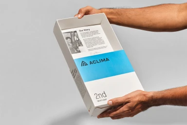
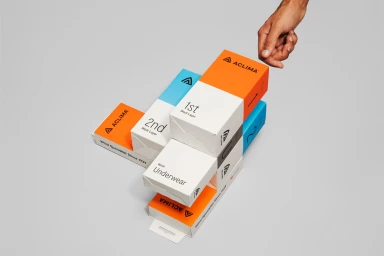
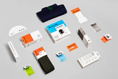
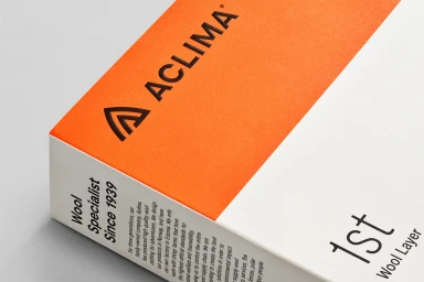
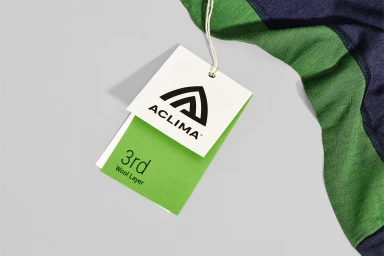
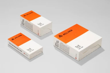
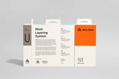
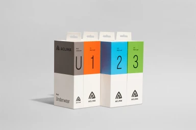
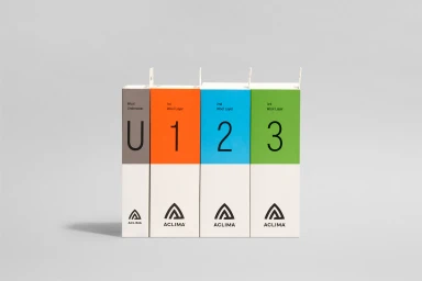
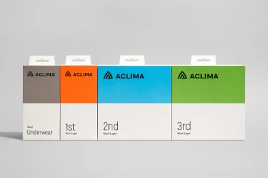
Aclima’s brand identity project establishes a visual system centered on clarity and a structured approach to its outdoor performance apparel. Designed by Neue, the identity uses a minimalist aesthetic to organize the brand’s wool layering system through bold typography and clear, color-coded packaging. The visual execution relies on a clean, horizontal hierarchy, utilizing a palette of white, orange, blue, and green to denote specific product layers. Each piece of collateral and packaging features a crisp, functional layout that emphasizes the brand's heritage as wool specialists. Photography by Calle Huth complements the graphic work, employing natural light and soft, even studio lighting to highlight the geometric lines and paper textures of the brand's identity system.
Horizontal, Commercial, Clean, Minimalist
Grey Seamless
E-commerce / Product

