
VILLAIN: Brand Identity
Aug 2019
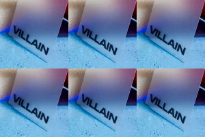
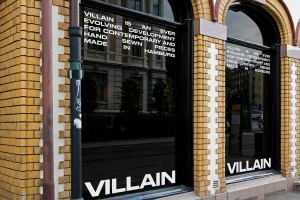
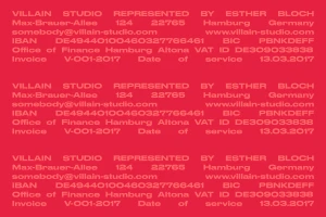
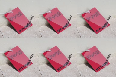
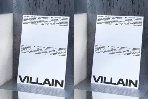
The brand identity for Villain reflects a sophisticated exercise in restraint, expertly balancing the harshness of its titular moniker with a clean, high-concept visual language. Developed by graphic designer Maurice Masson, the identity prioritizes structural precision and typographic clarity to anchor the studio as a provider of contemporary, hand-sewn pieces. Through a deliberate use of bold, sans-serif typography, the project leans into a corporate aesthetic that maintains a sharp, modern edge. Whether applied to architectural surfaces, such as the white-lettered glass facades on Hamburg’s brick masonry, or reduced to the geometric simplicity of a vector invoice template, the branding remains consistent and authoritative. The visual strategy effectively utilizes a vibrant palette—moving between saturated reds and contrasting cyan tones—to elevate routine business collateral into deliberate brand touchpoints. Techniques such as soft light photography and grid-based layouts emphasize the tactile quality of the materials, highlighting the tension between organic stone textures and the clinical, manufactured feel of frosted glass panels. By weaving typography throughout both physical retail environments and standardized stationery, the identity establishes a cohesive narrative that feels both globally scalable and intrinsically grounded. This is a masterclass in commercial minimalism, where every element serves to reinforce a clear, professional, and uncompromising vision for a modern fashion-forward creative studio.
Vertical, Commercial, Clean
Typography
Advertising Campaign
