
VERITAS: Brand Identity
Jul 2026
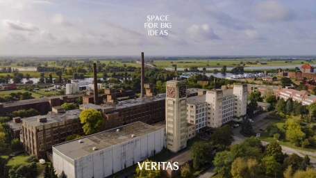
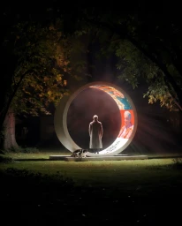
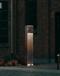
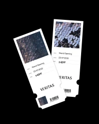
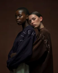
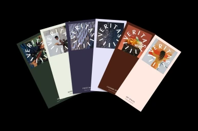
The new brand identity for VERITAS signals a sophisticated shift in corporate aesthetics, blending industrial gravitas with a modern, modular design language. Orchestrated by the team at Sonder Studio, the project moves beyond traditional identity systems to create a cohesive visual ecosystem that feels both expansive and deeply grounded. The brand leverages high-impact typography and a minimalist vector-style logo—often arranged in a precise circular formation—to maintain clarity across diverse assets, from grand opening invitations to studio-shot editorial portraiture. By grounding the brand in natural light and utilizing cinematic, live-action techniques for its environmental installations, the identity feels less like a sterile corporate mandate and more like a tactile, living experience. The use of drone footage and wide-angle landscape shots of historical industrial complexes highlights the scale and ambition behind the identity, while the intimacy of studio strobe-lit portraits of diverse models adds a human layer to the brand story. With its earthy color palette and careful attention to stationery design, the system manages to bridge the gap between heavy, weathered brick architecture and sleek, polished stainless steel. The result is an intentional, balanced aesthetic that leans into modular, editorial minimalism, proving that even the most institutional branding can carry a sense of mystery, warmth, and deliberate focus.
Commercial, Clean
