
Uncommon
Brand Identity
Jan 2018
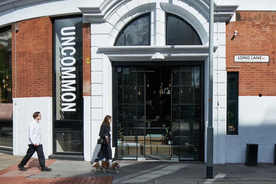
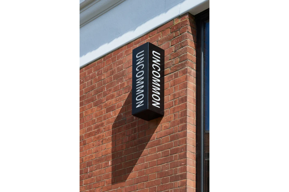
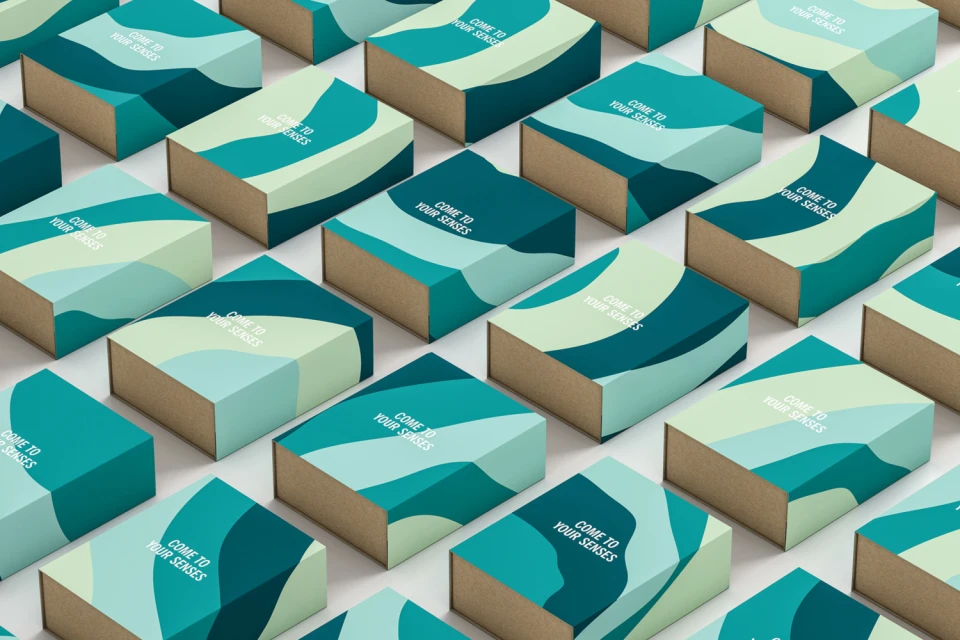
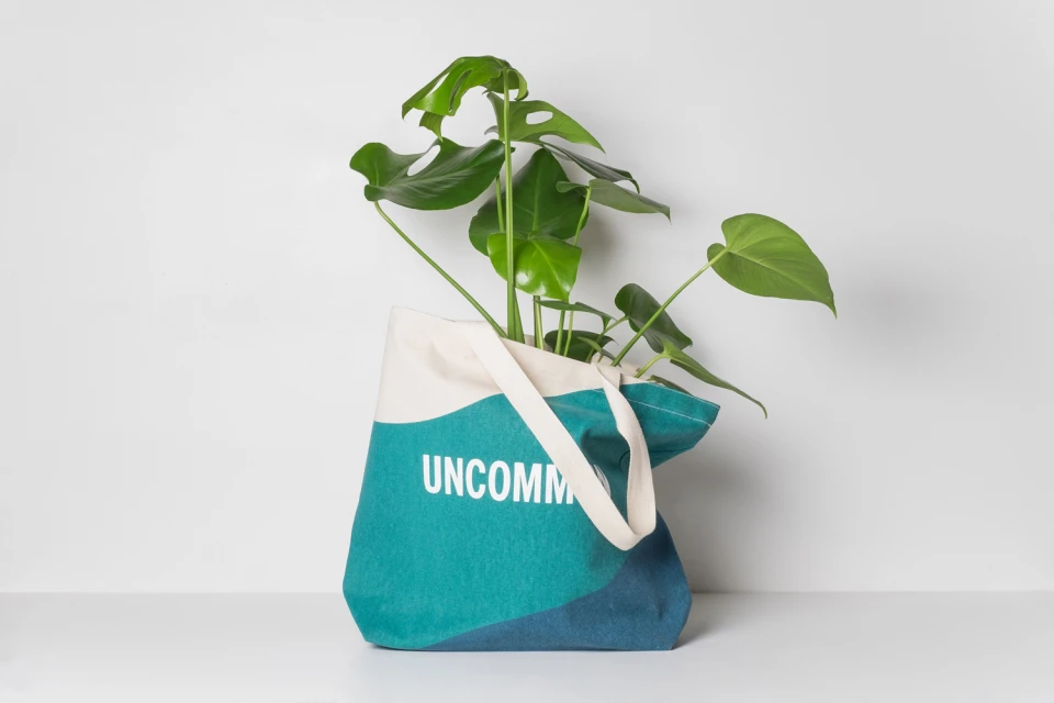
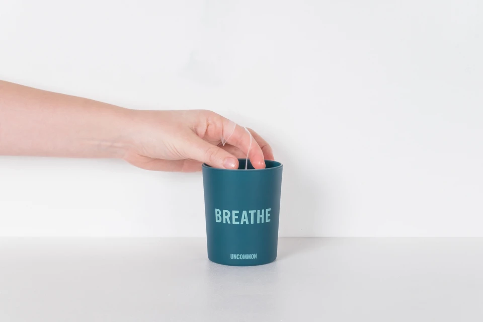
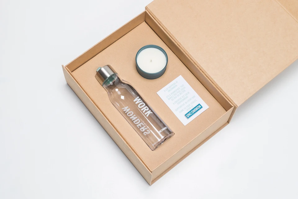
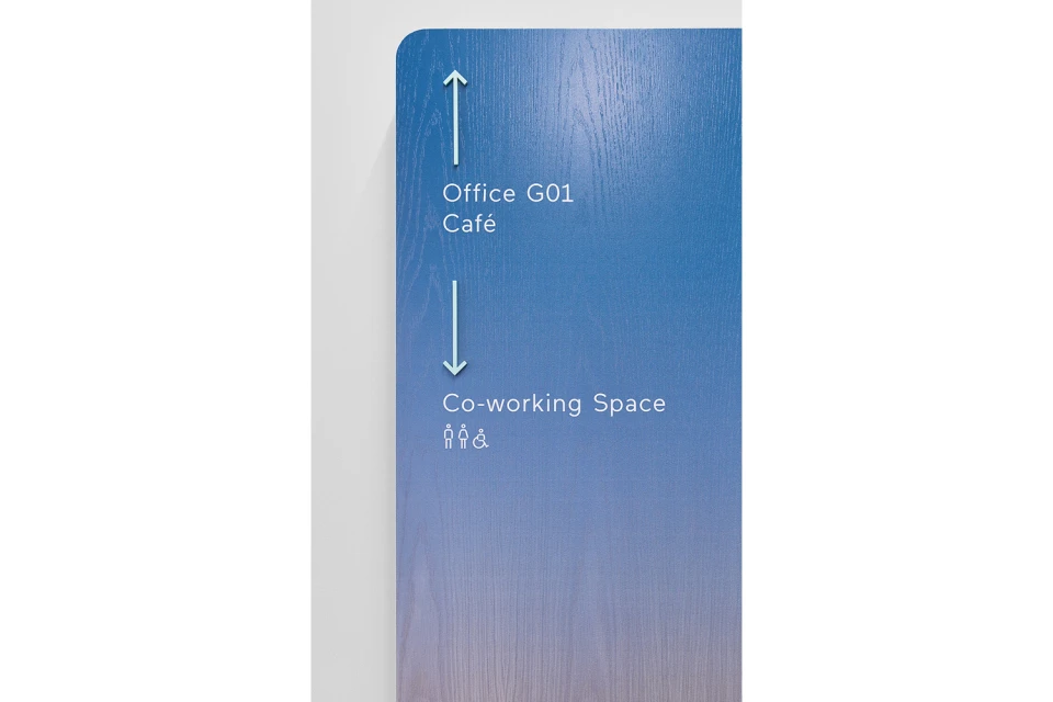
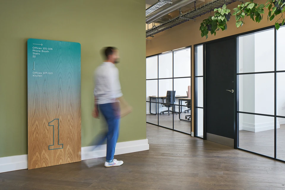
The brand identity for Uncommon reflects a masterclass in modern corporate aesthetics, seamlessly bridging the gap between physical architecture and immersive retail packaging. With graphic design led by Studio Makgill, the project leans into a minimalist, high-contrast visual language that is both professional and distinctly contemporary. By balancing the warmth of natural red masonry with the clinical precision of bold sans-serif typography, the identity establishes a cohesive narrative that flows from wayfinding signage in a bustling workspace to refined consumer touchpoints. The application of 3D render / CGI techniques allows for an isometric exploration of modular packaging, where fluid teal and aqua wave patterns invite a sense of tactile curiosity. Whether it is the documentary-style capture of street-level branding or the meticulous studio strobe photography of canvas totes and candle vessels, every element feels carefully curated. The project effectively channels an editorial minimalism, utilizing clean white negative space and strategic gradients to elevate the brand's presence. By integrating organic elements like monstera leaves and natural light into these corporate environments, the identity softens the hard edges of industrial architecture. Ultimately, this work creates a unified ecosystem where every touchpoint, from the subtle placement of floor directions to the curated contents of a gift box, reinforces a premium and cohesive organizational voice.
Horizontal, Commercial, Clean
