
Montgomery+Evelyn: Brand Identity

Apr 2019
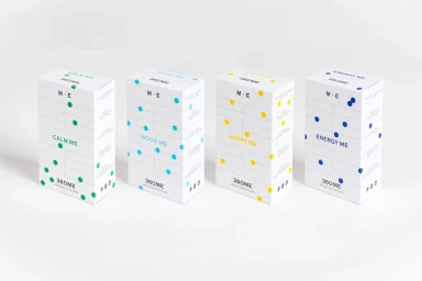
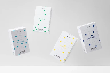
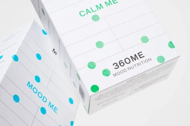
The new brand identity for Montgomery+Evelyn, executed by the design team at Studio Makgill, masterfully navigates the competitive CPG and food and beverage landscape by championing an aesthetic of clinical precision. The project leans into a minimalist and corporate design language that immediately establishes authority, positioning the 360ME Mood Nutrition line as a scientifically backed, modern solution. Through a disciplined grid system and a high-contrast palette, the packaging design strips away unnecessary ornament, favoring a stark white canvas punctuated by intentional, vibrant circular graphic elements that denote specific product moods. The typography serves as the visual anchor of the identity, utilizing a clean, bold sans-serif font that conveys both a medical-grade integrity and an approachable, contemporary sensibility. The imagery relies heavily on the art of commercial product photography, employing soft light to accentuate the structural form of the boxes and highlighting the crispness of the composition. By integrating macro studio techniques with a weightless, floating presentation of the product range, the identity successfully communicates a message of purity, evidenced by the emphasis on plant-friendly and filler-free ingredients. This cohesive brand system acts as a masterclass in editorial minimalism, ensuring that every element, from the centered logotype to the functional label details, functions to reinforce the brand's commitment to modern, nutrition-focused excellence.
Horizontal, Commercial, Clean, Minimalist
E-commerce / Product
