
Inglis Hall
Brand Identity
Feb 2018
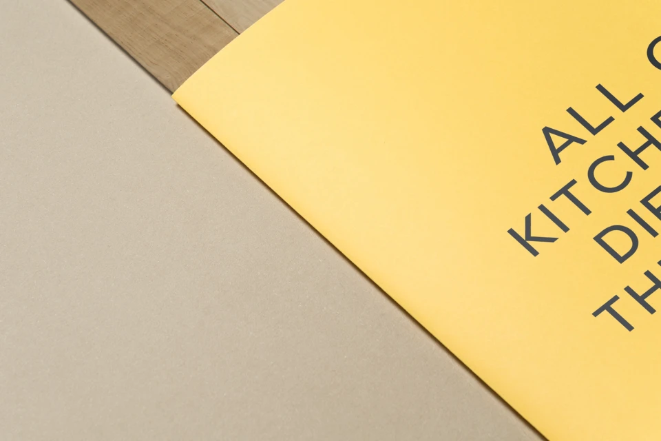
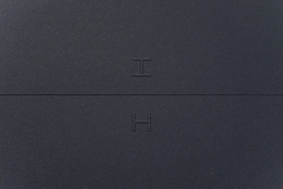
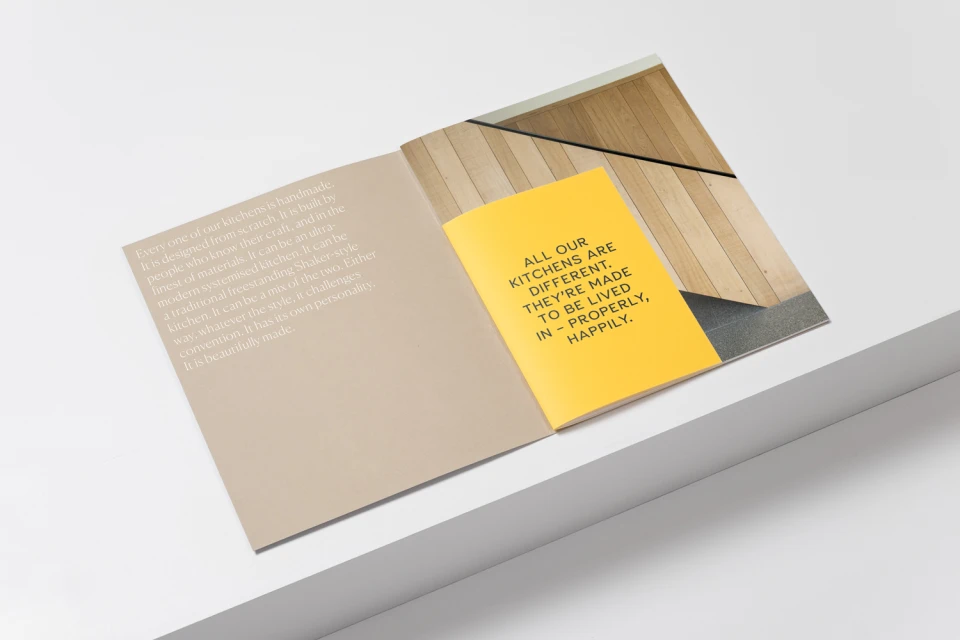
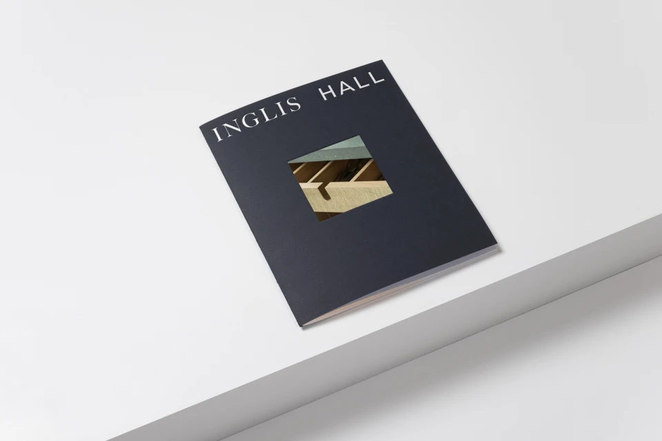
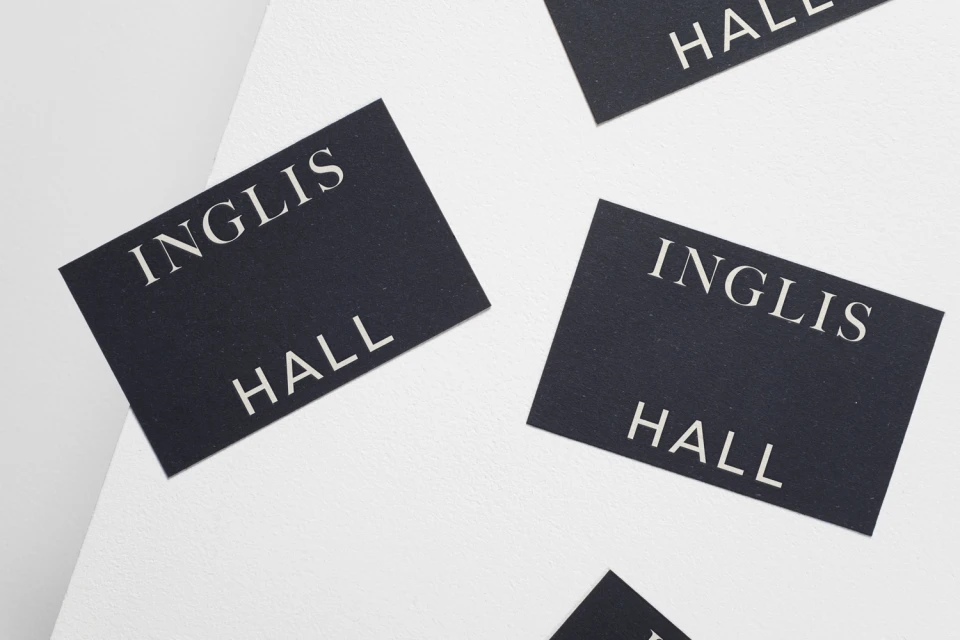
The brand identity for Inglis Hall serves as a masterclass in restrained corporate design, proving that luxury is often found in the deliberate interplay of texture, shadow, and negative space. Executed by Studio Makgill, this comprehensive commercial identity project moves beyond standard logo marks, opting instead for a tactile exploration of materiality. The visual system leverages a high-contrast palette, pairing deep charcoal and navy foundations with sharp, punctuating bursts of yellow. Through the strategic use of debossing, die-cut windows, and premium matte cardstock, the work emphasizes a physical, high-end feel that feels increasingly rare in a digital-first landscape. The typography fluctuates between bold, utilitarian sans-serifs and a more grounded, sophisticated serif, allowing the brand to communicate both structural precision and human warmth. Technical execution is handled with clinical care, utilizing studio strobe lighting to accentuate the geometric lines and layered paper compositions that define the collateral. By anchoring the identity in physical assets—such as business cards and structural brochures—the design team channels an editorial minimalism that feels both timeless and perfectly suited for the contemporary market. Every element, from the deliberate placement of geometric lines to the clean, symmetrical layouts, functions to reinforce a narrative of craftsmanship, making the brand feel tactile, professional, and undeniably cohesive.
Horizontal, Commercial, Clean, Minimalist
Typography
Advertising Campaign
