
The Infatuation: Brand Identity

Apr 2022
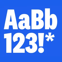
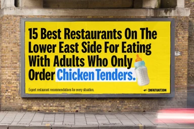
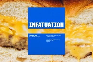
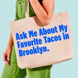
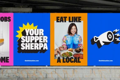
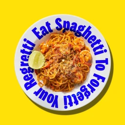
The Infatuation brand identity project establishes a comprehensive visual system anchored by bold, high-contrast typography and a vibrant, saturated color palette. This design work, executed by Center, leverages a mix of minimalist motion graphics and static graphic design assets to define the restaurant recommendation platform’s market presence. The identity leans into contemporary graphic principles, featuring clean sans-serif typefaces set against solid blue, yellow, and magenta backgrounds. Executed across diverse formats including outdoor billboards, studio photography panels, and merchandise, the system integrates textual slogans and stylized icons such as megaphones and starbursts to maintain a consistent aesthetic. The project prioritizes clarity and texture, pairing direct, minimal layouts with detailed food imagery to reinforce the brand's role as a guide for local dining.
Commercial, Graphic, Horizontal, Clean
Typography
