
The Drop Store: Brand Identity

Aug 2023
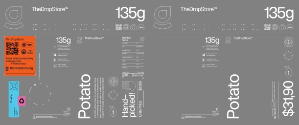
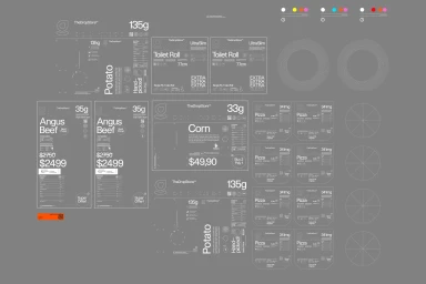
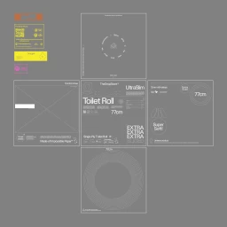
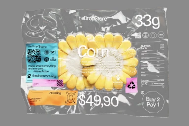
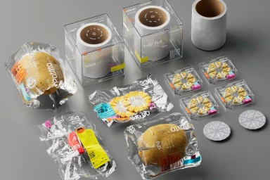
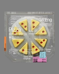
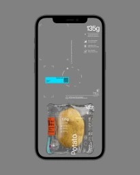
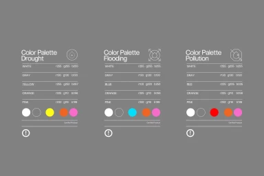
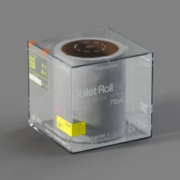
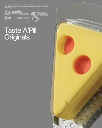
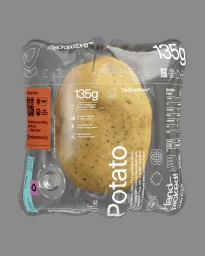
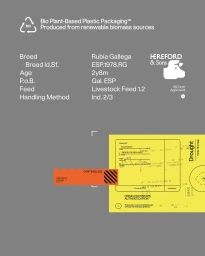
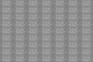
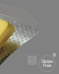
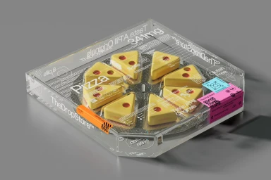
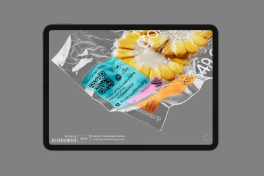
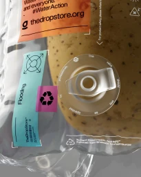
The Drop Store brand identity project redefines retail aesthetics through a clinical, minimalist lens. Developed by PLANT and Leandro Beltran, the work blends high-precision graphic design with advanced 3D rendering to transform everyday CPG items—from produce to household essentials—into conceptual, vacuum-sealed artifacts. The visual language relies on a neutral grey palette, punctuated by high-contrast orange and turquoise labels, and a consistent, utilitarian typographic hierarchy. Central to the project is the synthesis of technical data and commercial packaging. Each asset, whether a static render or motion graphic, employs clean vector lines and modular layouts to display nutrition facts and weight specifications. By integrating complex iconography and geometric patterns, the work adopts a futuristic tone that bridges the gap between traditional food packaging and laboratory-grade product visualization.
Commercial, Clean, Minimalist
3D render / CGI
Grey Seamless

