
Studio Lore: Brand Identity
Sep 2019
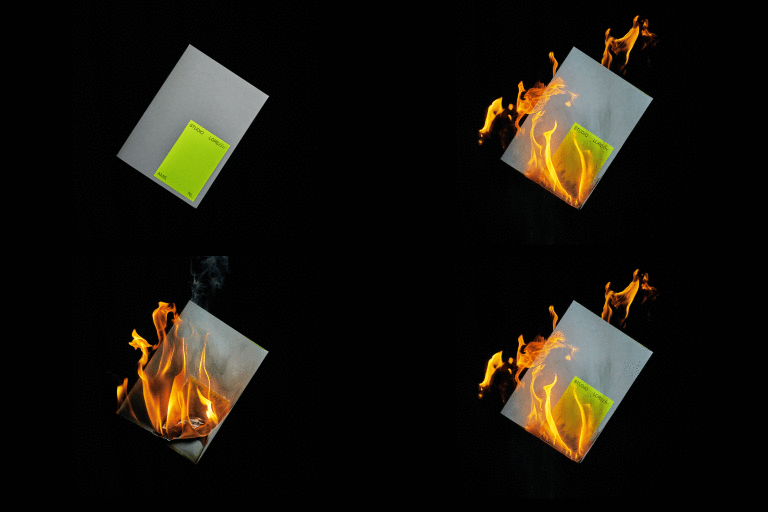
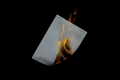
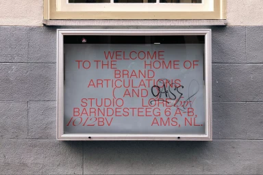
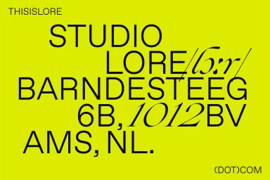
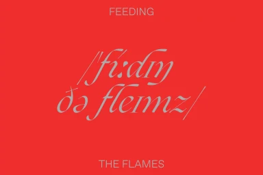
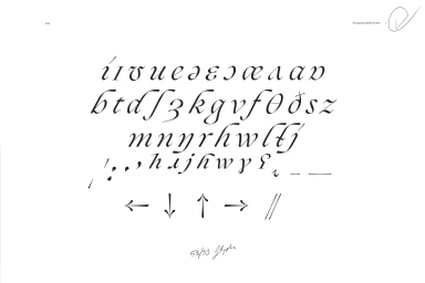
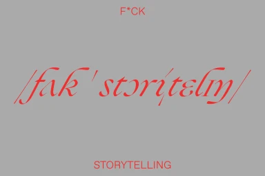
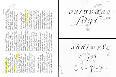
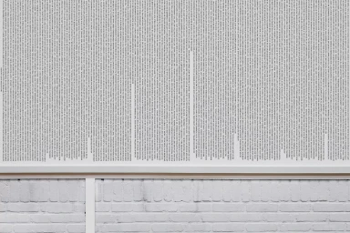
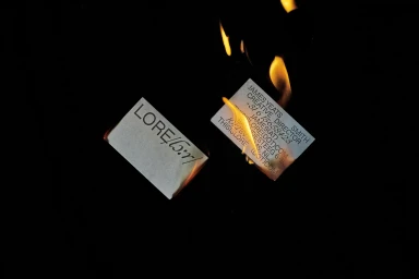
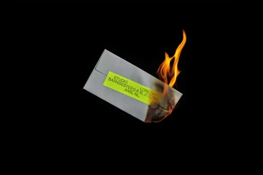
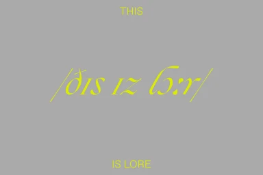
The brand identity for Studio Lore serves as a masterful exploration of graphic design within the digital media and entertainment sectors. Rather than relying on static logos, the project channels a rigorous, experimental approach to typography, treating letterforms as both structural assets and artistic expressions. The aesthetic leans into a high-contrast, minimalist visual language, where stark black backgrounds collide with vibrant neon yellow and acidic lime green accents. By blending technical specimen sheets with high-speed freeze photography that captures paper engulfed in flame, the execution elevates standard corporate branding into a visceral, cinematic experience. Amateur Dot Rocks brings a distinct personality to the work, utilizing clean sans-serif layouts alongside fluid, custom calligraphic glyphs to establish a cohesive yet subversive brand hierarchy. The identity balances an industrial, structured feel with raw, artistic impulses—evident in the recurring motifs of charred stationery and symmetrical typography. From the meticulous pencil-annotated design proofs to the final, bold environmental applications on textured brick, every element emphasizes precision and effective typographic hierarchy. This project succeeds by stripping away excess, focusing instead on the impact of negative space and the rhythmic quality of structured text, ultimately positioning Studio Lore as a defiant, forward-thinking player in the modern creative landscape.
Horizontal, Commercial
Typography
