
Festival Periferia: Brand Identity


Feb 2019
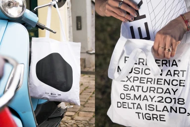
Festival Periferia’s brand identity signals a sophisticated shift in the festivals and events landscape, favoring a stark, modern aesthetic that prioritizes clarity and high-end minimalism. Developed by Amateur Dot Rocks, the visual system leans into a clean, monochrome palette where bold sans-serif typography acts as the primary driver of the experience. The identity intelligently navigates the dual nature of an immersive music and art experience, moving seamlessly from the functional rigidity of grid-based event collateral to the fluid, organic shapes found on custom merchandise like screen-printed cotton totes. By utilizing a topographic-inspired grid pattern across posters, menus, and even festival wristbands, the design creates a cohesive thread that anchors the brand in its specific geography of Delta Island, Tigre. This corporate design approach eschews typical festival clutter, opting instead for high-contrast macro photography and thoughtful lighting to elevate everyday event items—such as craft beer labels and food menus—into design-forward touchpoints. The result is a highly disciplined corporate identity that relies on the strength of its type-first system to communicate essential event information, while still capturing the lifestyle-oriented, natural light atmosphere of an outdoor gathering. Every touchpoint, from the billboard-scale typography to the subtle menu textures, reinforces a brand language that feels both functional and intentionally curated for a design-conscious audience.
Commercial, Horizontal, Clean
Typography
Advertising Campaign
