
Stelplaats: Brand Identity
Apr 2019
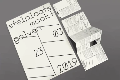
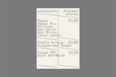
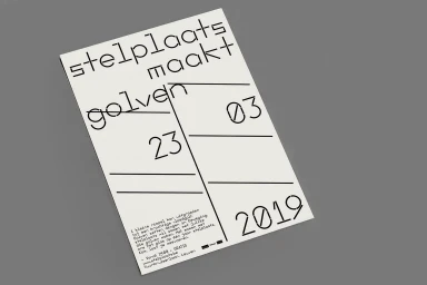
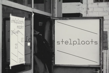
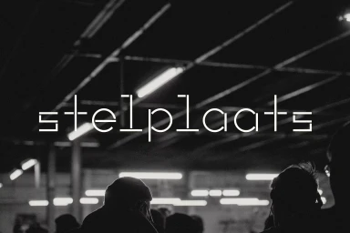
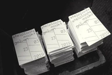
The brand identity for Stelplaats pulses with an uncompromising, modernist clarity that defines its role as a cultural hub. Developed with sharp graphic design by Corbin Mahieu, the visual system leans into a brutalist-adjacent minimalism that prioritizes legibility and structural tension. By utilizing a custom geometric sans-serif typeface, the identity functions as a cohesive language across diverse touchpoints, from print collateral and functional menus to large-scale environmental signage. The execution employs high-contrast monochrome tones and deliberate, negative space, ensuring the branding remains distinct even when applied to the industrial surfaces of an urban venue. Incorporating artistic typography and a rigorous grid system, the project translates a raw, nocturnal energy into a polished and professional interface. Cinematic elements, such as those seen in the live-action technique utilized for promotional assets, further ground the aesthetic within the pulsing, low-light atmosphere of its live music environment. Whether presented through folded accordion brochures or minimalist flyers, the layout utilizes diagonal slices and clean line work to create a dynamic visual rhythm. This project successfully establishes a corporate but edgy look that speaks directly to a contemporary audience, proving that when typography is treated as the primary architecture of a brand, the result is both timeless and strikingly resonant within the crowded landscape of cultural and commercial event spaces.
Horizontal, Clean
Typography
