
Nachtplan: Brand Identity
May 2019
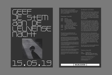
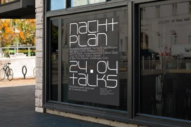
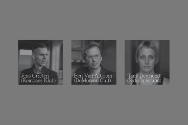
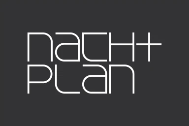
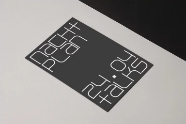
The brand identity for Nachtplan establishes a sophisticated visual language that thrives on the tension between stark monochromatic palettes and disciplined typographic precision. Through a comprehensive corporate graphic design suite, the project utilizes a minimalist aesthetic to distill complex event logistics and cultural programming into highly legible, geometric forms. At the heart of this identity lies a rigorous application of sans-serif typography, where large, bold letterforms serve as the primary visual anchor against deep charcoal backgrounds, creating a sense of contemporary authority. Graphic designer Corbin Mahieu expertly balances this editorial minimalism with a focus on negative space, ensuring that every element—from the two-part event flyers to the formal triptych of professional portraits—adheres to a consistent, professional grid system. The work effectively bridges the gap between commercial clarity and artistic intent, as seen in the wordmark, which emphasizes symmetry and clear letterforms to build a recognizable brand presence. By favoring a restrained visual hierarchy over decorative clutter, the identity achieves a striking clarity that stands out within an urban, architectural context. Whether manifested as large-scale environmental posters or detailed informational cards, the design channels an air of serious, modern inquiry. This systematic approach to branding proves that in the crowded landscape of cultural communication, intentional brevity and precise technical execution remain the most powerful tools for capturing attention.
Horizontal, Commercial, Clean, Minimalist
Typography
Solid Colour
